#there are also VERY VERY FEW storyboard shots
Explore tagged Tumblr posts
Text
The last time that I rewatched "The Fellowship of the Ring" (extended edition, of course), my favorite new detail that I noticed is that the characters, once they set out on their journey, are pretty much always traveling from screen-left to screen-right.
It had been a few years since I'd seen the films and I'd learned more about filmmaking in that time. I'm completely biased regarding the LOTR films; they're not perfect, but I grew up on them, I love them. I was trying to take notes on all of the little details that made the world of the films seem so rich and so enchanting to me. The camerawork, character staging, and editing is one of the many things that just happened to jump out at me at this time.
When Frodo and Sam are leaving the Shire, the camera is set up in such a way that they start on the left side of the screen (<- that side) and travel across it to the right side of the screen (-> that side).
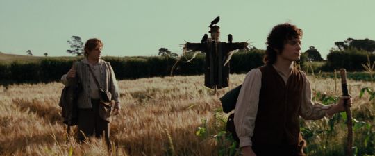
This way to go the farthest you've ever been from home. ->
As the hobbits travel from Bree to Rivendell, as the Fellowship travels from Rivendell to the Misty Mountains, all of those gorgeous scenic shots of the Nine Walkers show them moving from screen-left to screen-right. I haven't rewatched the entire trilogy lately, but in "The Fellowship of the Ring", it is so beautifully consistent.
There are a handful of reasons why this is done. In staging and editing, consistency regarding where the characters are placed on the screen is a storytelling tool. For example: the "180 degrees rule" says to generally keep the camera on one side of the characters within a scene, so that the audience can mentally keep track of the characters within the environment and focus on the action/dialogue. If we're watching two characters talking in a diner, even in the close-ups, one character will usually be kept on screen-left and be shown facing screen-right, and the other will be kept on screen-right and be shown facing screen-left. It feels stable. (People will sometimes choose to break the "180 degrees rule". It can be a tool to create a sense of disorientation and/or instability in the audience.)
In "The Fellowship of the Ring", the maps that the audience is shown of Middle Earth tell us that the Shire is located in the West (left side of the map) and everything else of relevance (Rivendell, Moria, Rohan, Gondor, Mordor) is East (right side of the map). As the characters consistently travel screen-right, the audience builds up a firmer mental map of Middle Earth and can better keep track of the characters' progress on their long journey. With every step that Frodo takes towards screen-right (->), we know that he is traveling East, taking another step towards Mordor.
Left to right may also instinctively feel like the way forward in a culture that writes and reads from left to right. Regardless of which way you write: if your film establishes extremely consistently that one direction is forward, then this visual language can be used to tell the audience that something is wrong if the characters start traveling from right to left. They might be lost! It builds suspense in the visual depiction of the characters going backwards and undoing progress! This all suits the lengthy hero's journey of LOTR very well, in my opinion.
There's an old joke that knowing how anything is made ruins the magic, and another old joke that knowing anything about filmmaking makes you insufferable to watch movies with, but I've never felt that way, especially not here. How does that quote go? It's still magic even if you know how it's done. (GNU Terry Pratchett.)
I find it enchanting, honestly, that so many people can work so hard for an effect that can seem so simple. Actors, directors, camera operators, editors, storyboarders, and so many others on the crew of the films consistently placed characters, sets, and props just so! So that the audience could more easily keep track of where everyone was and lose themselves a little more deeply in the story.
It's such a simple rule! And it works so well! Left -> Right. West -> East. Shire -> Mordor. Home -> Adventure. Known -> Unknown.
I personally recommend trying to keep track of character movement across the screen in films, especially if you have any interest in visual storytelling (films or illustration or something else). It's fun! It's impossible for me to unsee, watching "The Fellowship of the Ring" now, and I think it's a wonderful piece of movie magic.
962 notes
·
View notes
Note
I have a question and you might’ve been asked before, but animation, do you have any tips for beginners? Love your content btw 🥰
Even tho my degree is in animation I must be honest…😬 nowadays I very often don’t have the patience for anything more complicated than animatics. So I’m trying to stick to tried and true advice lol…
Probably the biggest tip would be that, yes the beginner exercises may be boring, and not look very cool, but they are essential to getting those skills you need down. The flour sack exercise, the wave principle—doing squash and stretch, and timing studies to really nail the way that movements should “flow” properly. These are absolutely necessary skills to master if you want to make fluid animations.
Planning is also another important, but sometimes overlooked aspect of animation. Some ppl (read:me) wanna just jump straight to animating. But planning in those first simplest stages really helps save you headaches in the later stages, when things are getting more complicated and all over the place. Storyboarding helps you plot your timing, choosing where key shots will go, camera angles, pacing ect.
And speaking of camera angles. STUDY STUDY STUDY cinematography! Something doesn’t have to be animated for it to be applied to animation. Perspective is a massive beast to tackle once you start storyboarding and unless you want boring shots and stagnant compositional framing, you need to learn all the ways you can frame a scene and your characters! Idk if you’re up for watching some horror movies, but those are a great source to pull from, as they tend to always frame, pace and even light their shots in really interesting and dynamic ways!
It’s also great to practice with free programs before you spend money on things like a subscription for photoshop or any other fancy software. Most interfaces are similar enough, that beginning with something free like Rough Animator or Blender can give you some good practice before you commit!
That’s all I can think of right now! And sorry if that wasn’t exactly what you were looking for…if you want me to try to give more specific advice on something just drop me another ask—I’m willing to keep rambling on!
Lastly, just few good videos I have saved!
Good traditional habits for digital animators <- basically Toniko Pantoja’s whole channel is a goldmine of knowledge!
Drawing figures in perspective
Every Frame A Painting is also a great channel for breaking down film/composition/writing—there’s a video for virtually every aspect of cinema
-Chuck Jones -the evolution of an artist
-Akira Kurosawa- composing movement
-Satoshi Kon- editing space and time
187 notes
·
View notes
Note
hello! i was wondering how long you've been animating for? and what got you into storyboarding & comic making? do you have any tips for comic making (paneling) & animating?
i've been animating since i was a teenager but i didn't start animating consistently until college, so a little over 5 years! but i've been making comics since i was little, so animating and storyboarding just kinda came naturally from that.
my general advice for comics is that it's all about flow and timing! flow is about determining the right pacing for your scene as well as making it readable. usually the panels flow from one into the other - like in the example below (by tracy yardley who is REALLY good at this stuff), the motion of the characters leads into the next panel, and the speech bubbles also line up with where the action of the panel naturally leads.

obligatory archie sonic mention complete
timing is just as important and can be conveyed in a number of different ways in comics. usually with my work, the size of the panel indicates how long i imagine the moment is. so a small panel is a short moment, and a large panel requires a bit more time.

long moments can also be split into multiple shorter moments if you break it up into numerous panels.
paneling itself can be pretty tricky - i tend to break a lot of my pages up into thirds first (at whatever proportion you need), then arrange whatever panels i need within those thirds.
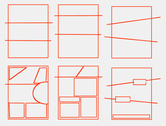
these aren't really rules that are set in stone, just a few things that i've found have helped me. you don't need to fill a whole page with tons of Stuff for a comic - it's all about figuring out how you want your story to flow through the page's space. same with storyboarding, that flow and timing is important in an even more literal sense because storyboards flows through actual time, not just space on a page.
idk if any of this makes much sense so. i also highly highly recommend the Comics Devices Library for other elements and principles you can use lol it's very good 👍
i don't have as many tips for animating since 1) i consider myself to be a comic/storyboard artist first and an animator second, and 2) animating is. very complex lol. if you're new to animating then i suggest starting SMALL and trying out some beginner animation exercises and the 12 Principles of Animation.
if you're already an animator and just looking for general advice then uhh. idk arcs are important. arcs are SO fucking important do not forget that most motions move in some sort of arc. also remember to label your keyframes and looping animations. and put secondary actions and limbs on different layers if you don't want to go crazy. also animate your character's eyes and pupils moving if a shot feels too still. yeah that's all i got good night tristate area
134 notes
·
View notes
Text
One Piece 1093
//long post, manga spoilers ahead
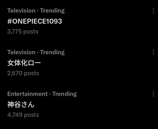
Congratulations to Law for his second time trending as "Law's female form" and congrats to Kamiya Hiroshi too for trending alongside him!! (her?)
I have no doubt that Law's role would always be special to Kamiya. The way he strained his voice to raise his pitch to a new high made my throat sore on his behalf..... But I liked it more than I expected! I could feel in my bones that it was an uncomfortable transformation Law wanted to free himself from as soon as possible bwahahah
I like the anime original dialogue とにかく、ヤベぇ���(tonikaku, yabee!) Even with my crap japanese it was as hilarious as hearing him say "Anyway, I'm cooked!" I don't think Law uses the term "Yabee" a lot so that felt refreshing lol

It seems the more controversial quote was this one, the speech in Japanese would be literally translated to "my strength isn't coming out as usual". Personally, I didn't immediately associate it to weakness due to being woman but moreso as an additional side affect that came with it, after all, it's dubbed as a disease. I like to think Doc Q didn't only come up with it as a deranged fantasy but to impose a real handicap for the victim to have their body modified in a way that limits their ability to fight and use their usual powers, either due to magic or just out of discomfort. Unlike Ivankov's fruit that alters hormones, it's just a physical change, it makes sense why it's more unnatural and uncomfortable.
The female Law scene was animated by Yuu Yoshiyama, he also did Hancock's scene from Amazon Lilly invasion episode. The scene was fanservicey but thankfully not as over the top as the Bonney scene from few episode prior to this one. The episode didn't drag on even during the slower parts, the screentime was well spent. The obnoxious, repetitive closed up reaction shots weren't there.
Moving on to B part, nothing much to speak of Ishizuka's brilliant storyboard that hasn't been said. My favorite observation was this:
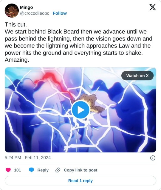
Some parts where characters didn't immediately follow up with a second attack was frustrating until I remembered Blackbeard and Law both put their lives on line when they use their fruit and so can't take risks. Cheaper trick shots and silly gimmicks that people blame Law for not using more frequently were probably never the best option. That said, unfortunately, Law lost the moment he used both his strongest attacks onscreen and failed. I don't think the fight was longer than what we saw here. The anime just made it more obvious.
Another anime original dialogue I liked is Blackbeard saying "what a handy ability you've got!" right before their final clash. He was using Tremor fruit until that point and then he switched to his OG attacks, it was unsettling how he's not only fighting but looking at Law's abilities as something that he'll soon take away from him. Unlike Doflamingo, Teach had no pre-decided plan involving Law's fruit and considered selling the fruit as appealing alternate as using it for its abilities. Honestly, we can't underestimate Doflamingo's knowledge. There's no way he stays in prison during the final arc.
And finally the Kuzan scene,,
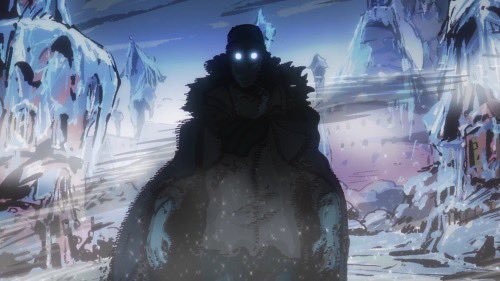
rightfully the most praised section and probably my favorite part of the episode too. According to his tweet, Henry Thurlow animated the Kuzan scene traditionally on paper. Let's give Toei credit where it's due; they let their animators take time, be creative and love their work. Otherwise we wouldn't get scenes like this.
And that's it! The first (and the last?) time we see Heart pirates in proper action. Ch. 1081 is only ~17 chapters away. Hopefully we'll see it animated around the middle of this year. Hopefully Law's current condition in the manga is updated by then, otherwise it'll be very painful.
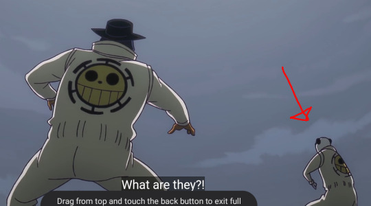

Twice already. Petition to let Pandaman become an official member of heart pirates.
#one piece#trafalgar law#trafalgar d. water law#marshall d. teach#one piece blackbeard#fem law#one piece meta#one piece anime#one piece manga spoiler#one piece episode 1093#kamiya hiroshi#mine#heart pirates#blackbeard pirates#pandaman#kuzan
108 notes
·
View notes
Text
山本泰一郎 Yasuichiro Yamamoto is a veteran artist who has been working on Detective Conan since 1996 and has directed many memorable episodes, such as The Mountain Villa Bandaged Man Murder Case, The Mist Goblin Legend Murder Case, The Night Baron Murder Case, and many more.
Back then, the series director was こだま兼嗣 Kenji Kodama (1–118). After Kodama left his position, Yamamoto took over the director role and continued delivering memorable episodes (118–332). He later took a long hiatus but returned to direct the series starting from episode 667 and continues to serve as the director of the Detective Conan anime to this day.
山本泰一郎 Yasuichiro Yamamoto storyboarded and directed episodes #927 and #928 - The Scarlet School Trip (#1000 to #1005 in the manga)
Despite the limitations and the lack in some departments such as the art direction or the color design, which have made it difficult to create a strong atmosphere for several years (it's still the case today), and despite the heavy workload, Yamamoto managed to make the two 40-minutes episodes both interesting and different from what we are used to, offering a different perspective given the constraints.
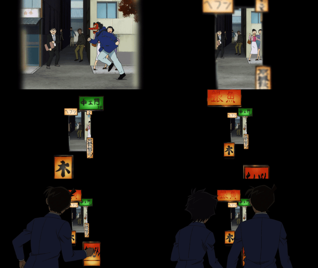
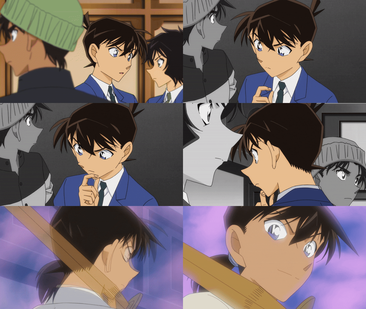
Rather than attempting to create something with a variety of different shots and opting for a contemplative atmosphere showcasing the beauty of Kyoto during the dialogues, Yamamoto used a significant amount of effects based on the manipulation of the layers in the composition of the scenes (the parallax effect). Since there were many conversation scenes, the director ensured not to overwhelm the viewer with many static face drawings where only the mouths would move, choosing instead to replicate a more dynamic feeling to compensate for the lack of strong character acting animation. Simple, yet very effective and eye-pleasing.
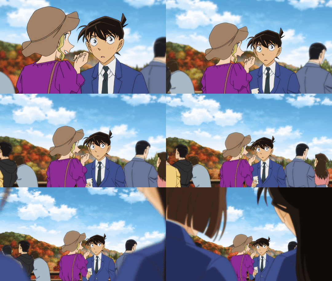
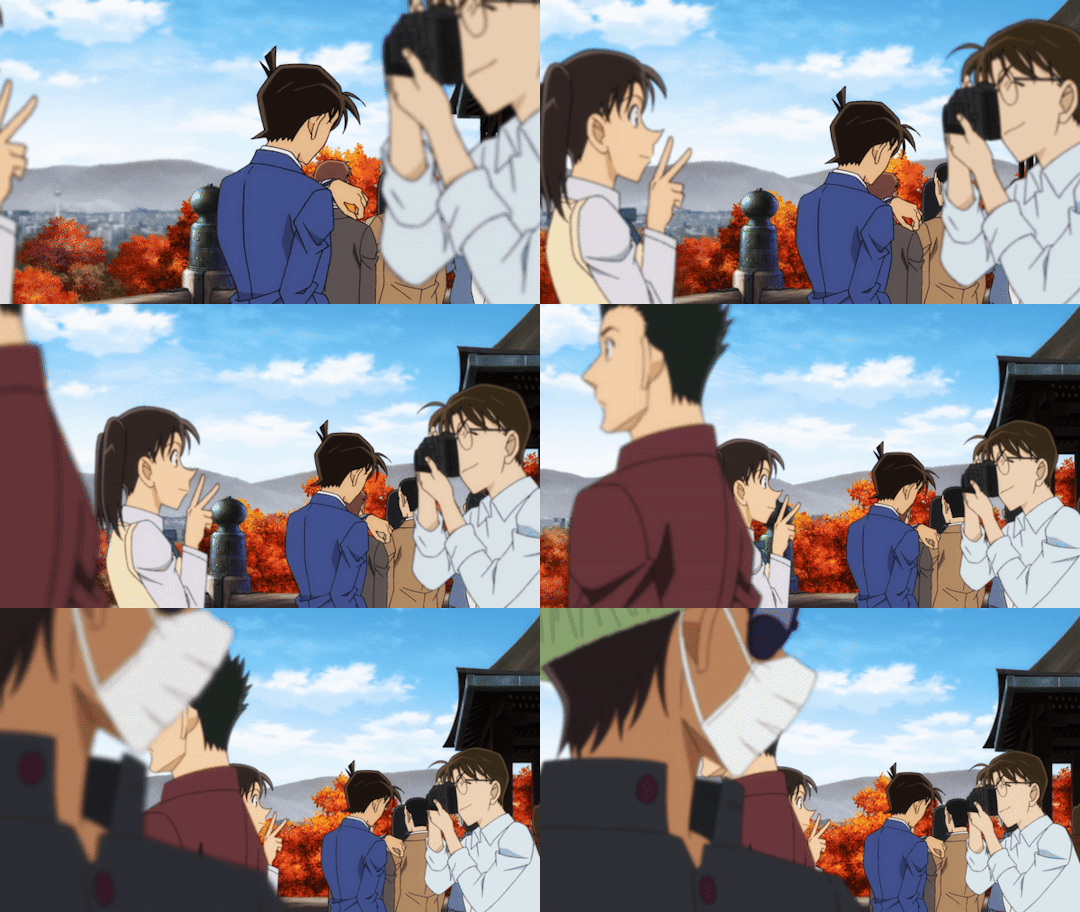
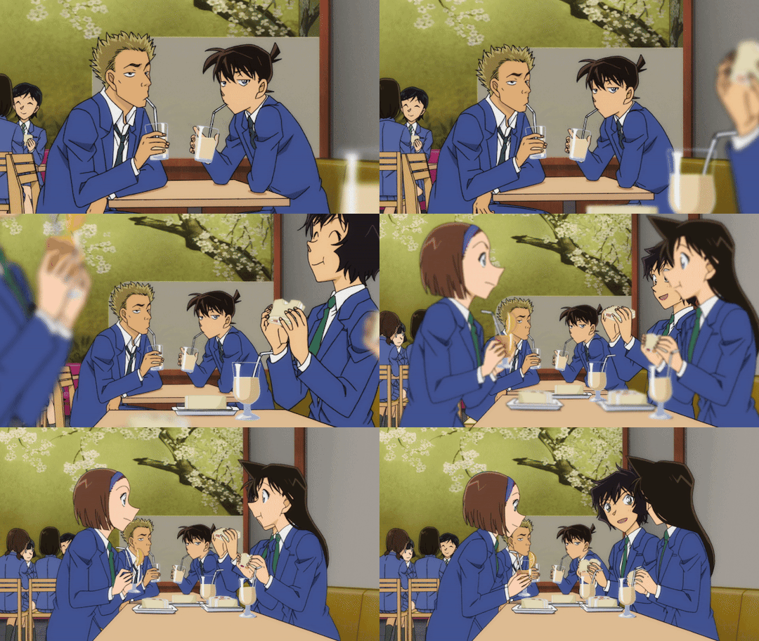
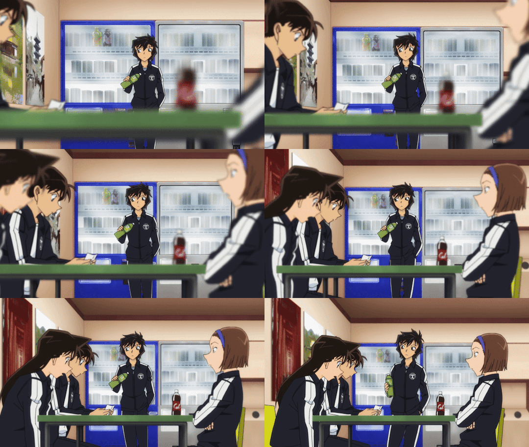
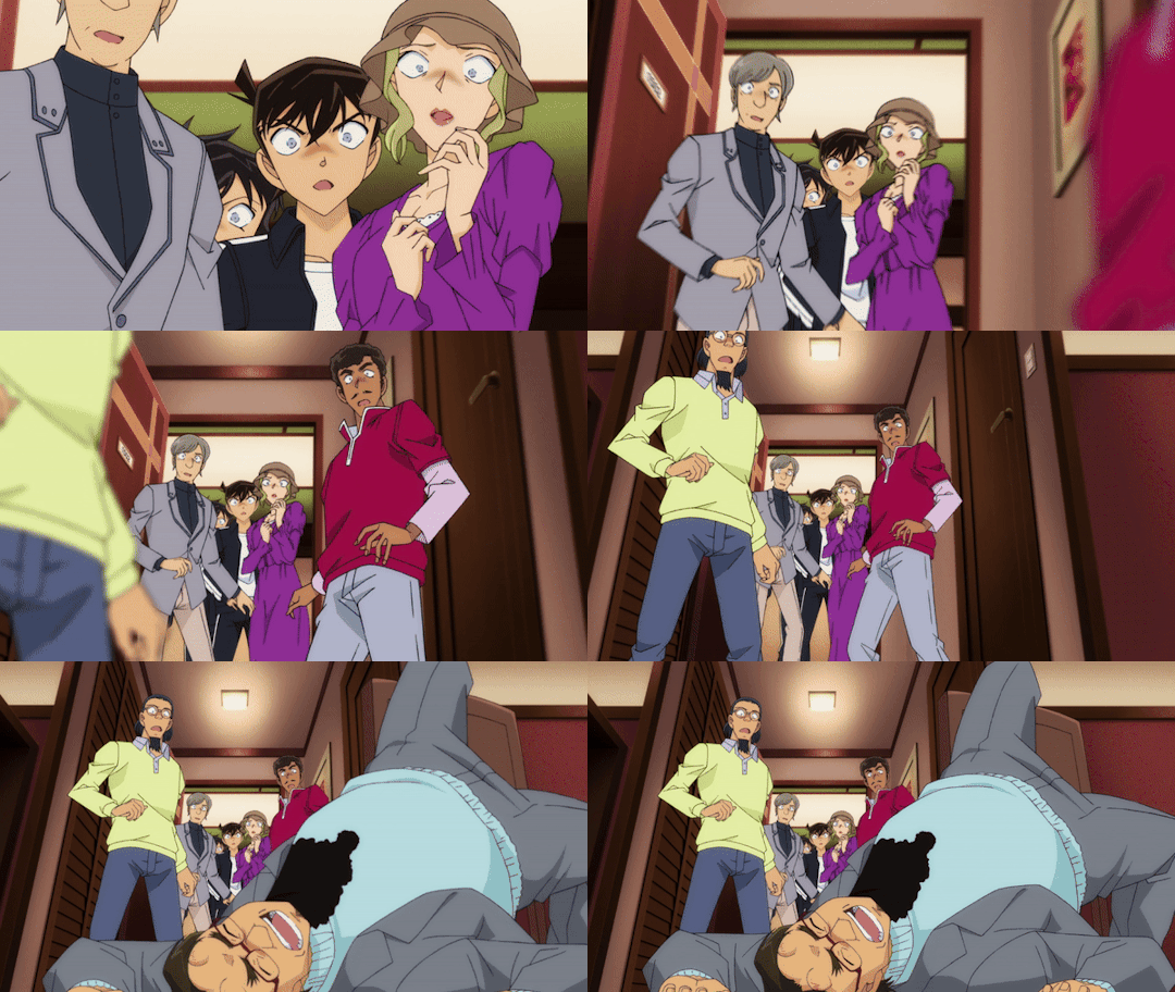
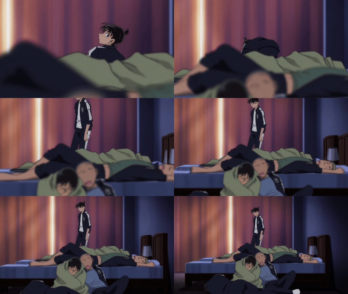
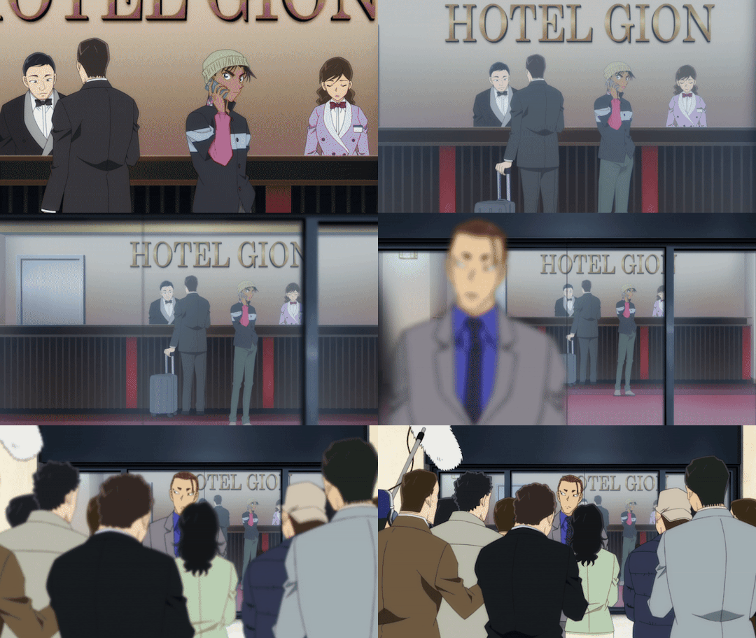
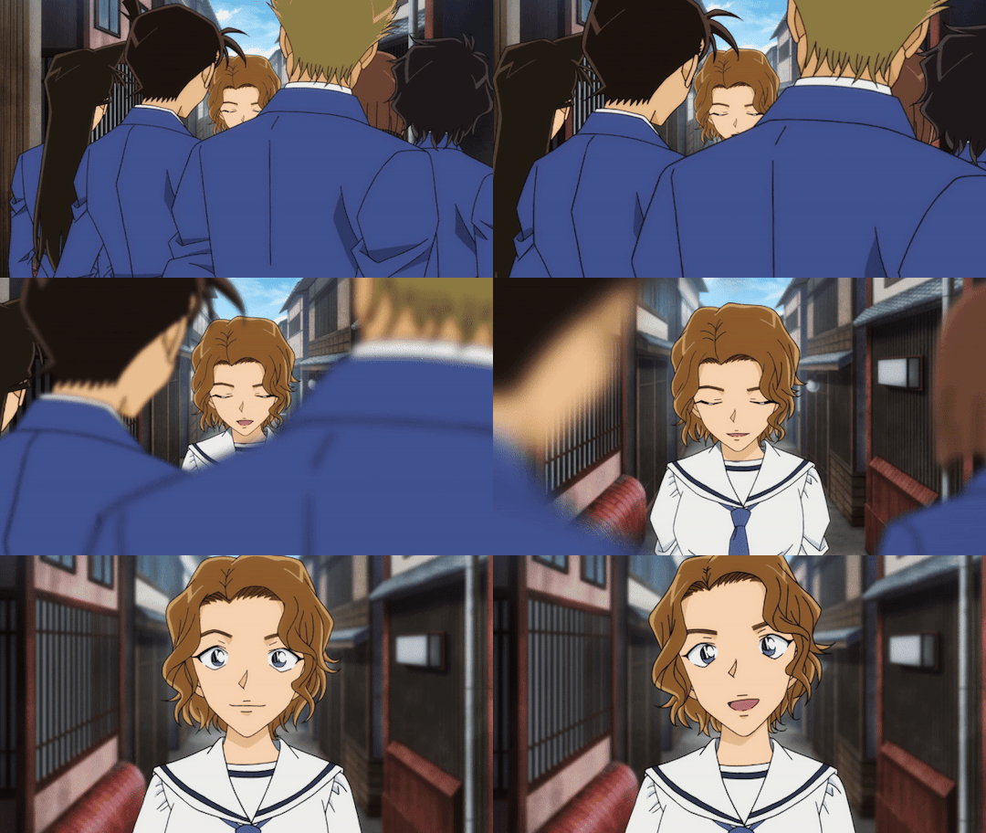
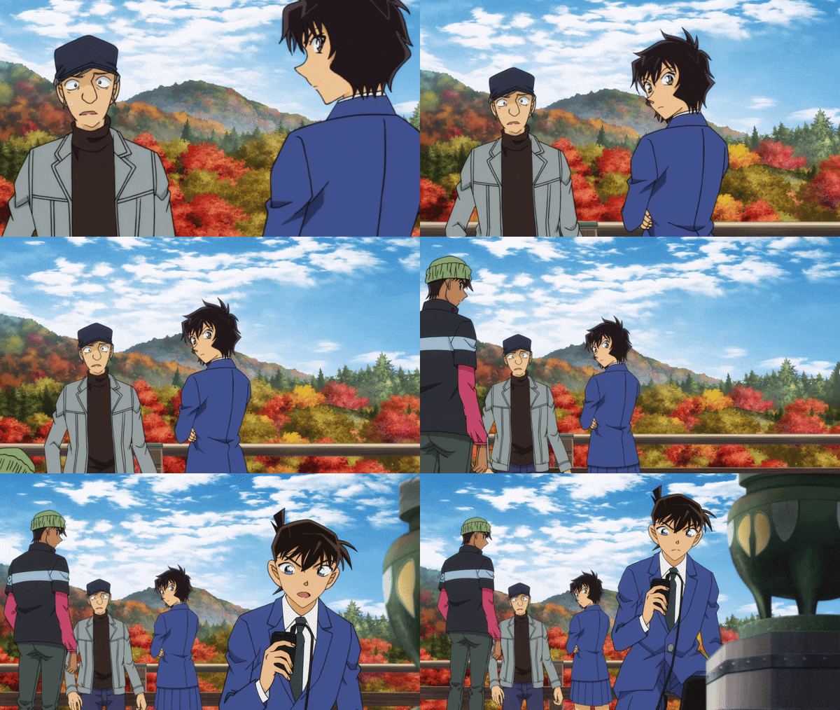
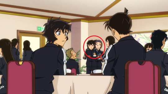
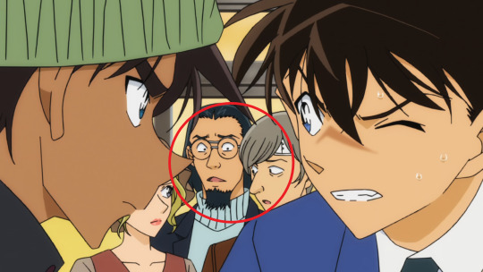
To avoid deviating too far from the main theme, which is the "school trip," many shots emphasize the feeling of constantly being surrounded and almost cramped by the Kyoto residents who live in the area, the students, the tourists, those staying at the hotel, the police later and so on. Either the main characters are in the background with people in front of them, or they are in the foreground surrounded by people behind them. With that philosophy in mind, every drawing of random people becomes important, it's even a must. There are only very few moments where Shinichi is left alone on the screen. This realistic framing also prevents Sera, for example, from interfering too much in his life while trying to get answers to her questions. Even when he is alone, there are always random people around him. Heiji, who is simply there to help his friend, is also framed that way, and the same goes for Momiji. The feeling of being cramped is present even in the smallest alleys.
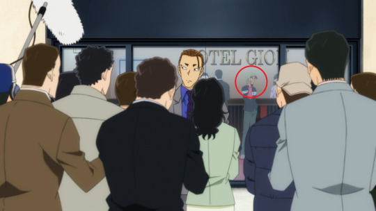
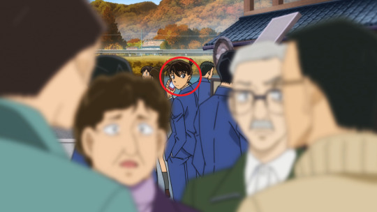
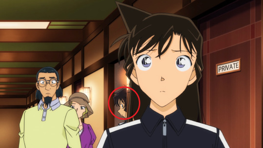
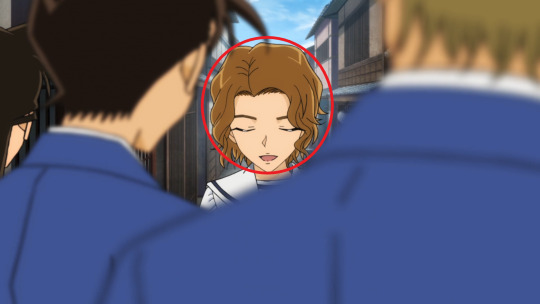
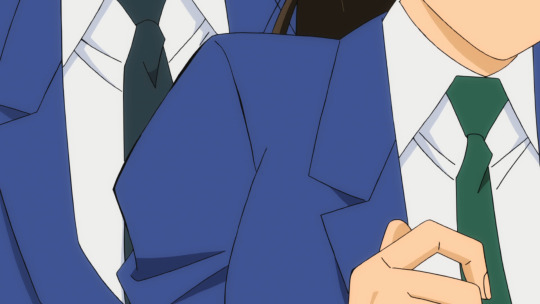
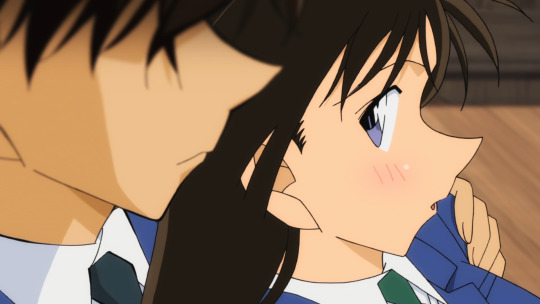
Throughout the episodes, the director doesn't hesitate to use close-up shots to establish a sense of needed intimacy between Ran and Shinichi. This is perhaps my favorite aspect of the two episodes, the focus on specific parts of the body and precise gestures to convey certain emotions, to build up the final scene. It's a way to update the characters and show their current state in a subtle manner and also a form of visual storytelling. This approach feels particularly powerful for a chapter that needed to be adapted this way. It's something that i find generally impactful when used in different medias, and something that was especially lacking in the chapters.
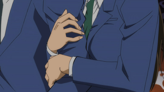
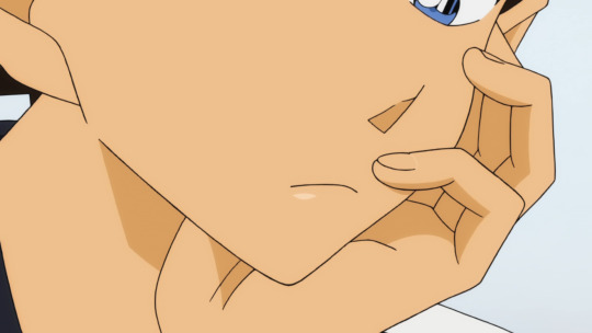
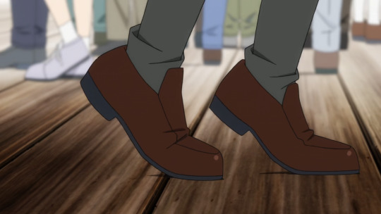
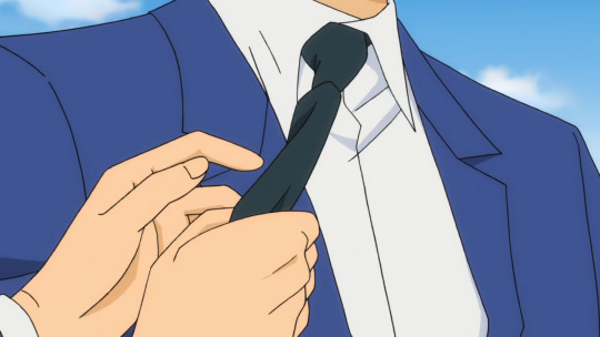
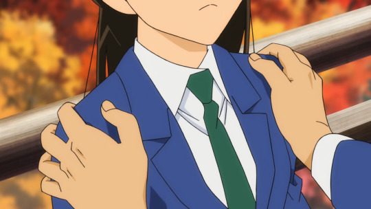
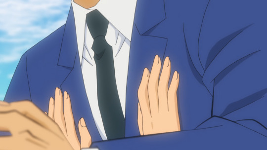
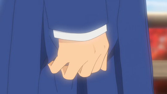
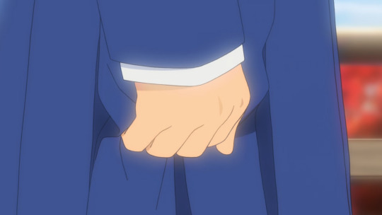
Cool color change and clean rotation.
Some storyboard sketches by the director :
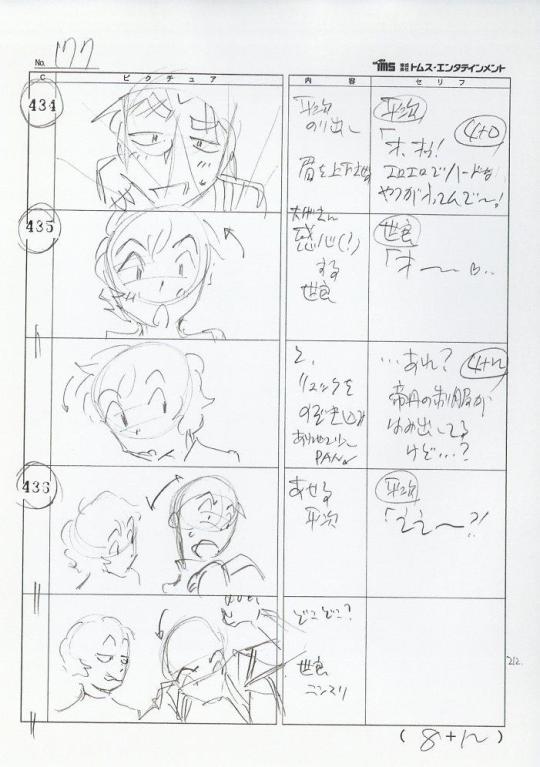
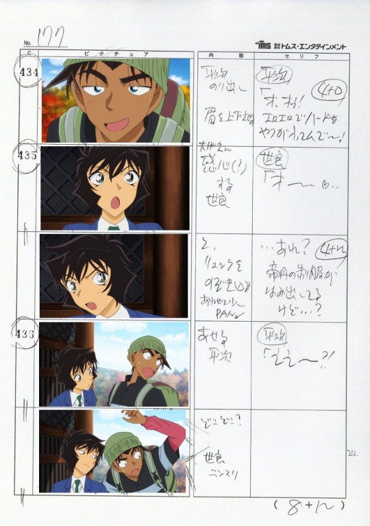
Basically, with this post, I wanted to say that the director, despite all the constraints, managed to create two very complete episodes with a clear vision. Of course, the episodes aren’t perfect, there are some janky moments and weak drawing/corrections here and there. Directing isn't just about putting beautiful shots on screen with crazy angles and things like that, it's also about knowing how to adapt and create something coherent while sacrificing certain aspects (in his case). For example, I find that the TV Special Episode One, also directed by him, much more polished than these two episodes. In any case, he deserves respect!
#名探偵コナン#detective conan#dcmk#gosho aoyama#case closed#anime#shinran#heiji hattori#kudo shinichi#storyboard#gif#yasuichiro yamamoto#ran mouri#hattori heiji
44 notes
·
View notes
Text
Kaiju Week in Review (January 21-27, 2024)
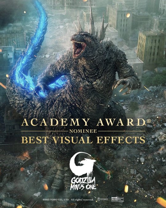
Godzilla Minus One made awards show history in both Japan and the U.S. this week. Its Oscar nomination for best Visual Effects is the first of the series (Godzilla [1998], Godzilla [2014] and Godzilla vs. Kong were previously shortlisted) and the first for any Japanese film. Small wonder Takashi Yamazaki, Kiyoko Shibuya, and their team went berserk when the nomination was announced. The other nominees are The Creator, Guardians of the Galaxy Vol. 3, Napoleon, and Mission: Impossible — Dead Reckoning Part One. According to IndieWire, The Creator has the edge, but Minus One could very well win. And while it naturally made less headlines in the Anglosphere, Minus One also picked up a whopping 12 Japan Academy Film Prize nominations, exceeding Shin Godzilla's 10.

Godzilla Minus One/Minus Color is now in North American theaters. I was intrigued enough to make it my fourth theatrical viewing of this movie, but in the end it did basically strike me as a gimmick. Godzilla Minus One was shot digitally with sets designed for color, so making it actually look like a film from the 40s was always going to be an uphill battle. Even with the regrade, there wasn’t a ton of contrast in most shots, and some of the scenes taking place at night were quite hard to see. Still, apart from the Odo Island massacre, I found the Godzilla scenes as gripping as ever.
Thanks to Minus Color, Minus One made $2.6 million this weekend, crawling back into the box office top 10. Its total in the U.S. and Canada now stands at $55 million, third among all foreign-language films released in the U.S.
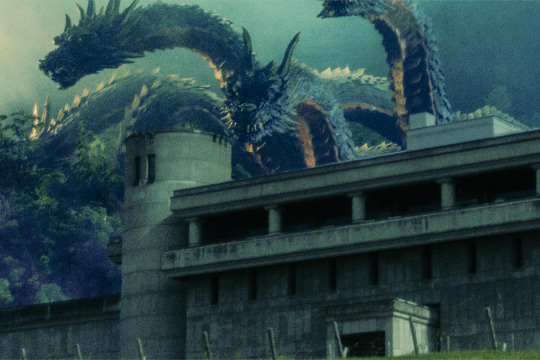
Brush of the God, Keizo Murase's directorial debut after a lifetime in movies, is finally complete. It'll play at the Osaka Asian Film Festival in March (link contains more images), and hopefully travel overseas very soon. Murase will also receive an Association Special Award at the Japan Academy Film Prize.
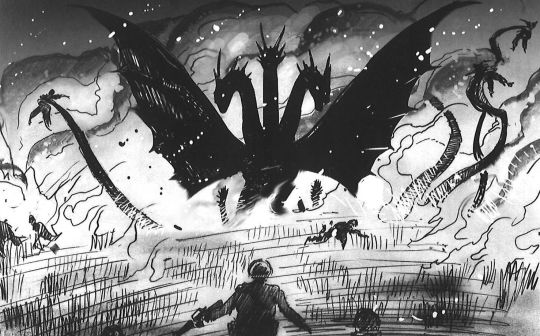
Clover Press shipped out copies of Godzilla & Kong: The Cinematic Storyboard Art of Richard Bennett to Kickstarter backers, myself included. It's an excellent art book, and there are plenty of deleted and altered scenes mixed in with more familiar sequences. Believe it or not, Bennett drew the panel above for Kong: Skull Island—they considered having James Conrad (Tom Hiddleston) flash back to an encounter with King Ghidorah in Vietnam. Not sure how that would've worked, as Ghidorah is generally not one to lie low for a few decades, but it's the first I've ever heard of it being considered. I'm hoping to post some more scans soon. Here's the order link.
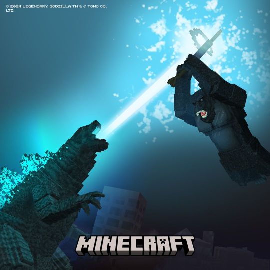
Minecraft social media accounts teased a crossover with the Monsterverse, in what's likely to be the most high-profile of the Godzilla x Kong video game collaborations. The Mobzilla mod was created over 10 years ago, so this is long overdue.

The big toy news this week was Titanic Creations revealing the digital sculpt for its Yongary figure. This guy's had even less figures than Gorgo - I can only think of one, and very few of them were made - so expect massive demand. New Godzilla toys were also on display at London Toy Fair, both at the Playmates booth and among the plushies made by an unknown company.
#kaiju week in review#godzilla minus one#godzilla#yongary#minecraft#king kong#kong skull island#king ghidorah#art#orochi#brush of the god#kaiju#tokusatsu#godzilla x kong the new empire
103 notes
·
View notes
Note
since i can't answer myself so well, what would you say are asada nemui's distinctive storytelling traits and on a personal matter if you'd like what makes you like her stories? not so much tropes but running themes, art and such. i hope it's not too heavy of a question and thanks ^_^
Hi, this is a great question. For anyone with the patience to read all this I think it might help explain what makes Asada Nemui such an intriguing manga artist. (especially without the "it's because X reminded me of Y! - type analysis that occurs very frequently in english fandom communities)
There's a lot of images in this post, but it's not too spoiler-ish.
Comments about art
The first aspect of Asada's art I would want to praise endlessly are the page layouts. Dear, My God was one of the first stories I read by her and the flow of the panels is what really stuck out to me. I like using this sequence of pages as an example - can you guess what's going on?


I removed all of the dialogue and SFX, and it's so well laid out that the sight-to-panel direction, background design and expressions of the characters are enough to understand what's happening. It almost feels like you're looking at a scene from a movie or storyboard.
Text version:


While reading The Sound of the Waves, a page describing the plot of a writer's story more or less summarizes Asada's layout style. It generally begins with an establishing shot before laying out the rest of the scene, which with a longer story may take a few more pages to conclude.

The divisions of pages seems to average around four to seven panels, and pages with three or fewer panels show up very sparingly - likely saved for more impactful scenes.
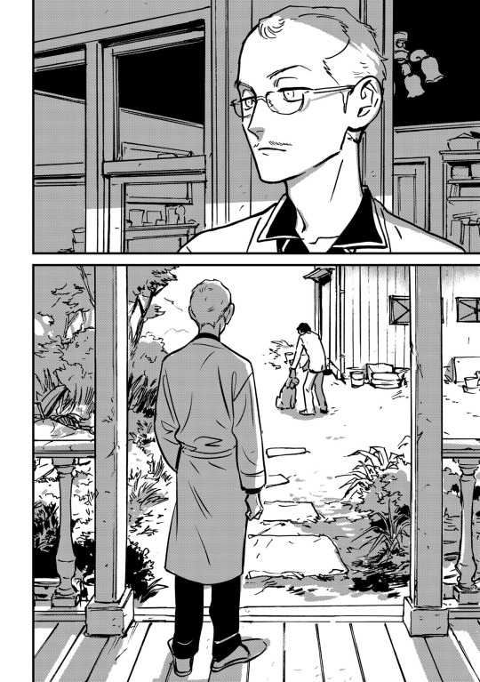

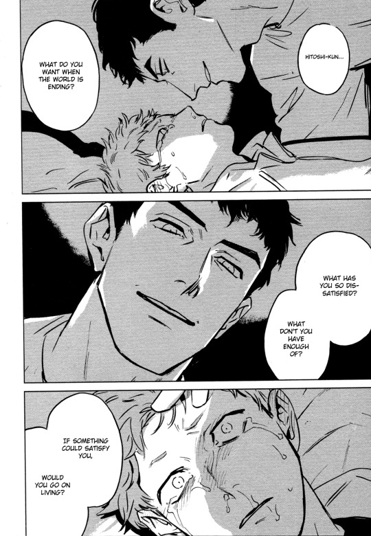
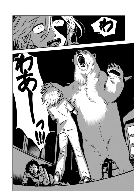
(I'll just take a second here to add how much I love that she generally sticks to one shade of screentone. Limiting the palette to just three values is a great way to create shadows and dramatic lighting effects!)
Asada's direction is very focused on telling a story - there is always some type of visual cue that the scene is actively present and happening in front of us, the readers. I like this continuity compared to a series that might have excessive headshots or pages of flashbacks during a scene with a lot of action.
One of my favorite scenes in Sleeping Dead is in the second volume, when Mamiya is out in his van and attempting to construct a conversation. It fills an entire page, but his entire monologue could have been condensed into one "thinking" panel.
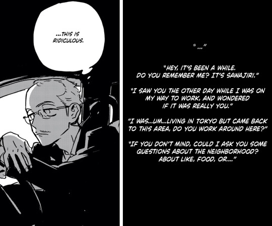
It doesn't necessarily look bad like if it were like this, but Asada intentionally uses the entire page to emphasize Mamiya's expressions, his awkwardness as he slowly loses confidence in himself. (Plus he's actively driving and looking at the road.) I like that this is a very private scene that reveals the inner character he tries to hide during the majority of the first volume.

I also like that she understands the importance of a readable layout enough to redraw areas that might be confusing to look at, like this one from the magazine version of Sleeping Dead (left side) :
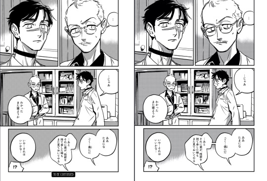
In the last panel it's difficult to tell who's talking, because there are four detached bubbles and you can't see Sada or Mamiya. I wasn't sure if Sada was talking in the first bubble since it's directly below him, but the second seemed like Mamiya since it's drawn so awkwardly. For the paperback release she added a line to connect the two bubbles - obviously it's Mamiya saying both and becoming nervous as he brings up the possibility of having more sexual activities with Sada.
If you noticed the changes in the other panels of that page it also goes into her tendency to do redraws. Some of them look quite different after they've been changed - from the series I've read I noticed major redrawing for Dear, My God, the older short stories republished in Ai, Sei, and even Takatora and the Omegas (though Asada credited changes in that one to the fact that she's now working 100% digitally).
My opinion for these is kind of mixed, sometimes they do look better and sometimes I prefer her original style. This one from Dean My Love that appears in Ai, Sei is a crime lol.

There was a two-volume manga called Mangaka Gohan Nishi (Breakfast, Lunch, Dinner and Comic Artists) published in 2015, and it has one page comics by mangaka discussing food they eat. Asada appears in the second volume and her page mentions watching movies.

(basically it's about being bad at / injured by stovetop cooking so she prefers the safety of the microwave. But in the unidentified movie the characters make an explosive device with a microwave…)
I would undoubtedly say films are a large influence to her, and I've caught some parallels/references in her work, but it's kind of a disservice to only point out similarities in characters or genre tropes rather than her skill as an artist and storyteller.
During the last couple years Asada's also been fairly active on Twitter where she shares concept art and extra comics that add more to what she was limited to write in the published works.
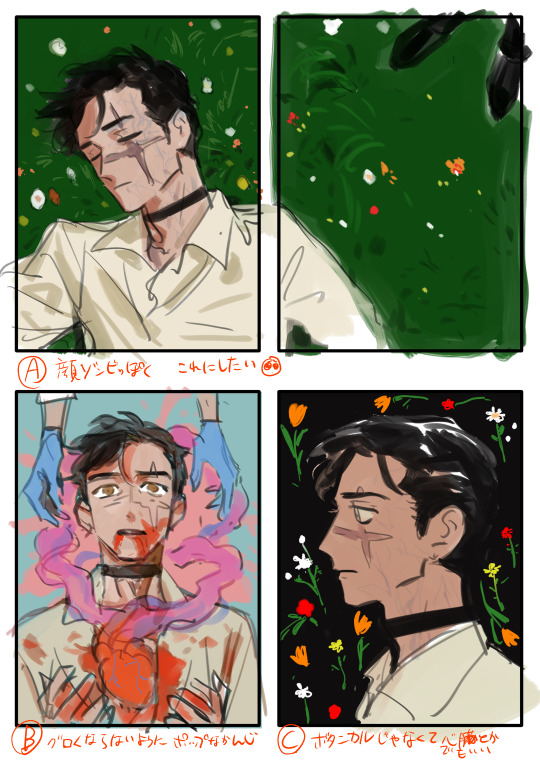
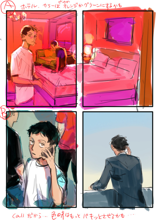
For Takatora she's even been live-streamed the planning and inking of its (as of now) upcoming chapter on Pixiv Sketch. The series already has over two dozen pages of extra content judging by a numbered page she shared on Twitter.

Overall I appreciate that on top of having a high output she seems to care a lot about the quality of content her readers are getting. Not every artist makes redraws for their series on top of doing multiple serializations and lots of fanart/doujin content.
(And she has made a lot of fanart and doujinshi. For 10+ years.)
Comments about storytelling
I'm probably going to sound more rambly here, because I'm not a writer or a critic. Regardless of which series I enjoyed or disliked, I think most of them have an element of pushing boundaries in BL manga.
As one Japanese reviewer said when commenting about Sleeping Dead - Asada's manga are the type you want to recommend anyone to read...except you can't.
I think it goes without saying that the focus of sex in her manga can be a barrier, but there is enough range in her work that a reader (with some help) would be able to find a story with an amount of sexual content they'd be comfortable with. I could definitely see Asada working on more non-BL titles like The Swerve, Yoi and A Friend's Funeral, but to be blunt...she seems to really enjoy drawing men having sex.
Boundary-pushing can be apparent in most of her manga, especially when it starts as early as the first chapter. In the least extreme variation, her titles like Sleeping Dead and Call feature somewhat jarring love interests - middle-aged, sexually awkward men that are unconventionally designed compared to other BL love interests.
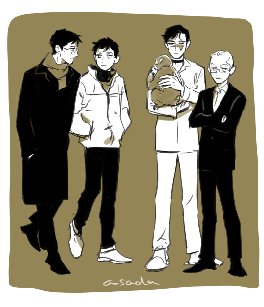
When the second volume of Sleeping Dead was nominated a Chil-Chil award for its story, Asada shared this illustration of Mamiya in a boxing ring. I love to imagine it as him squaring off with the much more handsome and less follicly-challenged ukes of the other nominated series.
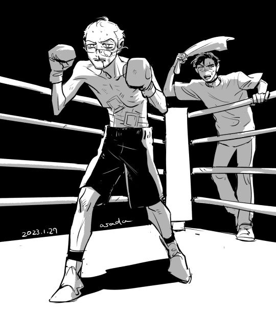
If you check out her earlier series there are a few subjects considered taboo to look at. Sexual violence occurs pretty frequently. Surprisingly (or not, if you've been around long enough), it's not even rape that's considered risky subject matter in BL magazines.
According to a recent interview with Chil-Chil, Asada originally planned to publish Takatora and the Omegas with a different publisher (my guess is Shodensha, since they serialized My Little Inferno in OnBlue), but its inclusion of sexual health topics was considered too extreme:

[Interview translation credit goes to Ikari of Bottom of the Sea Scans, which currently scanlates Takatora and the Omegas.]
Thanks to Canna being willing to publish her more explicit story ideas, we might be able to see how far she planned to go with Takatora. The published chapters have already broached subjects including hysterectomies, abortion and sexual autonomy. I think this situation with Takatora has parallels to the struggles female shoujo mangaka faced in the early decades of manga publishing for girls.

The magazine Canna tends to serialize BL stories that include elements of science fiction and fantasy, which I think has made it a place where artists like Asada can have less restriction in their storytelling.
But...I don't want to praise Asada just for tackling difficult topics. Going back to the comments about page design, there's a huge focus on dialogue. Characters are frequently conversing and making eye contact with each other. She's amazing at writing characters with unlikable traits that are still enjoyable to read about, or are paired with a partner that helps balance out, or even tolerates their faults.
I think it can be easy to drop a series if it has unlikable characters, but she tends to put them in situations that question their ideologies, and we get to see how they change over the course of the story. Even Asada commented that she's not a huge fan of how the protagonist of Takatora and the Omegas acts:

Takatora could wind up being one of the most extreme examples of an unlikable protagonist, but we'll get to see if his bigoted views are changed as he's challenged by his peers, and as he offers his own support to solve their troubles.


At this point I totally got lost in the Takatora sauce, but other little aspects I love about her manga are the humorous moments, the sometimes getting too over-her-head writing, and endings that can be unexpectedly gut-punching yet written in a way that's the most grounded in reality. And in Sleeping Dead's case, immediately followed by a whiplash of silly extras.
I hope that with Takatora and Yoi - which seemed to have planned out for a while - Asada can continue to do her own thing, because I think it's a much better creative output to make whatever the hell you want instead of conforming to the preferences of the publishers.
In conclusion:

33 notes
·
View notes
Text
A Sign Of Affection Episode 4: What Kind of Voice
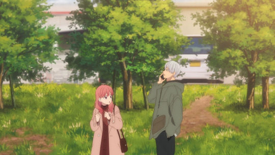
Boy oh boy there is a lot to talk about with this episode. Incredible production, incredible boards, incredible plot and character developments- it's got it all. So much so that it's hard to really put it all into words, but I'll do my best.
First off, let me talk storyboards. Yuta Murano has been insane with this series, boarding every episode so far- and he's been killing it, hell, even carrying it on his back (since he's the series director as well).
Anyways, point being that Murano has been incredibly intelligent in regards to boarding with this episode. How, you might ask? Spacing. The whole episode really hammers home the idea of space, both around characters but also between them. Murano leans heavily into the wider layouts like you can see above, but similarly uses first person perspective to create a strong awareness of the space between characters to help provide more feeling to Yuki and Itsuomi's relationship.
One super easy example is Kyouya and Itsuomi's late-night interaction. The combined use of first person perspective between the pair, as well as the wider shots between to show the empty space around them, really highlights their nature as friends incredibly well. He also really likes using doors and whatnot to frame the characters, and I love it.
Hell, I'll take it a step further too. See how Itsuomi is able to see Kyouya's face, but Kyouya can't see Itsuomi's? That's intentional, and shows how open Kyouya is vs how closed Itsuomi is. Very very great work.


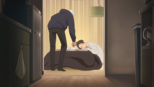
And then there's this example with Shin and Emma. It's really subtle, but we never get a first person shot from Shin within. Even with Emma's singular first person shot he's slightly off center. The whole interaction is framed as Shin being there for a reason other than what Emma feels he's there for. His body language and demeanor, the way he reacts to Emma's words, there's considerable distance between the pair, and that gets illustrated very easily with the table in front of them.
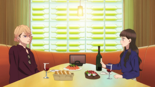
Of course, my favorite pieces of this are with Yuki and Itsuomi. No barriers, no space between the pair, all of their shots really sell the idea of the empty space that exists around them as a pair.
I also just love that Murano has Itsuomi's personality down so well. He always strikes the exact same pose when focusing on talking with Yuki


Speaking of him, I love how catty he got with Oushi earlier on in the episode. Really fun addition to his very playful but reserved personality.
But lets rewind and dig a little deeper into that whole sequence.
Oushi, once again, really shows off his true colors a little too blatantly when talking with Yuki. The easiest comparison to make is the fact that Oushi is hitting Yuki's head while Itsuomi only ever pats it. Combined with the sign language for "cute", you really get a grasp on the challenges that face Oushi. Does he not pat her head because he knows what it means in sign language? It's hard to say, but paired with how he plays with her hair I think it's pretty easy to say that he does have some awareness of those things, and it probably comes from Itsuomi.
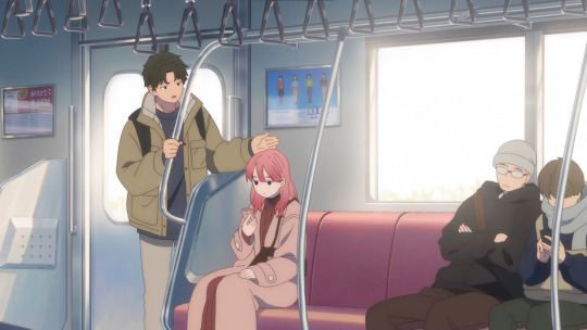

Anyways, moving forward again. While questionable behavior that does highlight Itsuomi's more... challenging side, I might say, the interaction between him and Oushi is really really great.
Firstly, because Oushi tries to use his familiarity with Yuki and sign language to put down the people around her so that he can take the top spot, but also because Itsuomi claps back and completely destroys him.


Of course, when it rains, it pours, so there's plenty of other character interactions in this episode.
Really, it's something that I'm incredibly critical about with my slice of life and romance series. The world itself is very wide, and people have more than a few friends. Being able to express that while preserving the core intent of the series can be challenging, but it makes a massive difference in overall quality and breadth.
And A Sign of Affection aces that aspect. Kyouya and Rin, whatever Emma's got going on with Itsuomi, then of course Oushi as well. There's a solid cast of characters that exist to surround Itsuomi and Yuki, and even more that exist in the periphery. It makes it feel so much more alive, and creates far more interesting dynamics that can ebb and flow based on which characters appear and where.
Though obviously, the main focus is Yuki and Itsuomi here, so that's where the majority of the effort goes, and it's entirely worth it. Just even simple things like Oushi only being seen in a crowd today vs Itsuomi being isolated when with her.
You might say that's just how the visuals shake out, but obviously a Costco isn't ever going to be that quiet so the idea is that because of Yuki, the focus is on Itsuomi so we don't really see much of any background characters.
Add on top the incredible sound design, and in this episode voice acting, and it's just a flawless experience. We as viewers experience the world in a surprisingly different fashion to Yuki, and the episode highlights that with things like the tone of Itsuomi's voice.
Incredibly simple and small details pepper this episode and the story at large, but they end up insanely important to comparing and contrasting the viewer's experience against Yuki's, challenging us to think and view things through her (very cute) eyes.
Anyways, let's put the icing on the cake here with animation and other work.
We know that this production is hand-obsessed due to the sign language, but that quality extends to other aspects. Being a very reserved and casual series there's not a lot of room for impressive animation, but the episode still finds way to show off with cuts like Shin cutting hair here.
Similarly, 2D vehicles? It's really a whole other flex. The requirements for keeping such a detailed object on model, all while in motion is really really incredible. And there's a surprising amount of those cuts in the episode.

Overall, A Sign of Affection continues to hit home run after home run with each episode, and delivers an experience that is only possible because of the medium. Creative to the max, it does everything in its power to elevate the source and create and entirely unforgettable experience. Saturdays really have been great this Winter season.
#a sign of affection#yubisaki to renren#ゆびさきと恋々#yubiren#yuki itose#nagi itsuomi#anime and manga#anime#anime reccs#anime recommendation#anime review
57 notes
·
View notes
Text
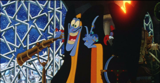


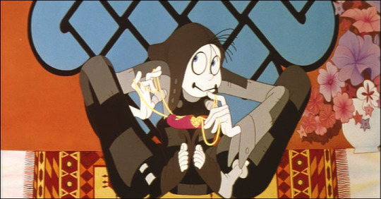


https://youtu.be/FC4sYmilGF8 The Thief and the Cobbler Recobbled Cut Mark 5 Work in Progress 06/20/23
This restoration is still a work in progress. It contains new animation which has not yet been completed, and is "half done" in this preview. At times, there are unfinished edits and smudgy frames.
"Animation among the most glorious and lively ever created!" - The New York Times "The best and most important 'fan edit' ever made." - Twitch Film
Chief Restorationist: Garrett Gilchrist
Directed by Richard Williams Screenplay by Richard Williams and Margaret French Master animator Ken Harris Produced by Imogen Sutton and Richard Williams
Here is your first sneak preview of a newly re-restored version of this lost animation classic, written and directed by legendary three-time Academy Award winning animator Richard Williams (animation director of Who Framed Roger Rabbit, and the author of The Animator's Survival Kit). Nearly 30 years in the making, a labor of love by a team of animation greats, this was to be the masterpiece of Williams’ career, perhaps the most ambitious independent animated film ever conceived. It was taken away from Williams when he couldn’t meet his deadline, recut and destroyed. It has never been seen the way it was intended to be seen … until now. Based on Williams’ original workprint, missing scenes have been restored using storyboards and unfinished animation. Restored to its true form, this lost cult classic has finally been found - for you at home.
2023 could be considered the 60th anniversary of when production began on the film that would become "The Thief and the Cobbler." 2023 is also the 30th anniversary of when production ended on the film, when a reedited version called "The Princess and the Cobbler" had a very small release in some countries. 2023 is also the 10th anniversary of "The Thief and the Cobbler Recobbled Cut Mark 4," a restoration by filmmaker Garrett Gilchrist which intended to restore the film to its original intended form, as much as possible. This is also, approximately, the 25th anniversary of Gilchrist's first experiments with restoring this film.
So we thought it would be a good idea to go back and restore the film further, and see what could be done with it. We still do not have access to a high quality HD copy of any version of the film (such as the released version "Arabian Knight" or Williams' workprint "A Moment In Time"). We do have some 35mm workprint scenes, which we transferred in HD for this project, and which make up over 30 minutes of the film. Some scenes were also upscaled and rebuilt in HD, and all scenes were cleaned up and restored frame by frame by Garrett Gilchrist. Any Blu-Ray labels that would like to take on this project with us officially can contact us.
Garrett Gilchrist writes:
I had often said that I wouldn't do a "Mark 5" edit unless an HD version of the film (in any form) was released and could be used for a better quality version. The "Recobbled Cut" project was begun in 2006 and continued until 2013, originally. That's eight years of work restoring the film (frame by frame in Photoshop!) and building up a huge data archive of Richard Williams' work (Available via ocpmovie at archive. org). I wasn't going to return to the project without a very good reason to do so. No new footage has turned up in our hands in the last ten years.
But it's been ten years since the "Mark 4," and I was approached by animators Dennis Van Hout and Kiko Pablo (The Crow Artist), who had animated a few new shots for the film. It's very difficult, without a budget, to create the sort of high quality animation that this film requires. However, their efforts showed me that it's possible. I had just completed inking a Thief and the Cobbler Coloring Book (available at archive) and felt more confident that I could draw and ink in Richard Williams' style. I chose about twenty shots that seemed possible to animate, and began work on them in early 2023. You can see a half-finished version of the results in this video. I am still working to bring the results up to standard as much as possible.
I also "re-restored" most of the film for this version, rebuilding some shots in HD using cropped DVD sources, recoloring some shots to appear higher quality, removing dirt and damage in Photoshop frame by frame, and doing months of new work to bring the film to life like never before. We were never happy with the HD transfer of the scenes of The Thief in the War Machine, which are very red and dark and lack detail. Some color correction trickery helped bring more detail to the scenes, and dirt and damage was removed by hand in Photoshop over the course of several months.
Other HD scenes were also restored by hand, which had been overlooked for the previous version, because I'd been working on it for eight years at that point and had to stop somewhere. The U-Matic video source for the workprint was also revisited. Pencil test scenes are hard to see due to the low quality of the video source, and I went back to the original source for this version, and cleaned up the scenes very carefully frame by frame to bring out quality and detail that was previously lost. Scenes that previously switched from one source to another have been cleaned up as much as possible so that the sources match seamlessly. Some workprint scenes have been recolored by hand to improve their quality.
The scenes directed by Fred Calvert were done on the cheap and are not up to the quality standards that Richard Williams intended. In this edit I have reworked the Calvert scenes as much as possible, so that they play more smoothly with additional inbetweening. I have removed animation errors and improved scenes with special effects, and rebuild some scenes in HD. This work will continue as time allows.
Our newly animated scenes are also a work in progress, and will require further work to make the animation smoother and more in line with the rest of the film. I am just one illustrator and do not have the budget of a professional animation studio, so I'm really pushing my luck by trying to insert new animation into a cult-favorite masterpiece by one of the greatest animators who ever lived. But I also was careful to choose scenes that are less complex in how they move. It's been a lot of work, and it's still a work in progress. But I hope you enjoy seeing what I've been up to all these months, as well as the delightful new animation by Dennis Van Hout, Kiko Pablo, Chris Fern and others.
#the thief and the cobbler#animation#richard williams#theif and the cobbler#princess and the cobbler#arabian knight#thief and the cobbler#ttatc
150 notes
·
View notes
Text
Idk in my idyllic world the use of ai could improve animation workflow and catapult junior level artists into creative leads roles faster if there's less menial work to be done.
We could have artists still in charge of creative decisions and drawing vis dev while the computer assists with the most labour intensive steps of making shows or movies.
For simpler shows for instance it would be neat I think if you could run your storyboard through a script and have the machine import all relevant assets staged to the best of its abilities instead of manually having to drag props and rigs into your shot and scaling everything before you can even begin to animate (does that tech exist already? Probably).
Like nowadays we already have animation programs where you can set deformer limitations.
youtube
i could imagine a possible future where software includes or does subscription services to ai trained on work by artists who got paid to draw or animate template motions or anatomy references. something like generating smart bones could become an automated feature. i can maybe even foresee tech that can look at a character model or design sheet you've drawn and generate a rig for it. in all these scenarios you would have to correct stuff and tune things to your liking, but it gives a considerable head start to the work.
More dynamic shots could be made on smaller budgets if we gave ai props or backgrounds and said "give me this but rotated a little" instead of drawing the same damn chair from 10 angles as a prop artist, I refuse to believe anyone's passion in life is to make prop turnarounds or clean up inbetweens.
what if you had an ai that was trained on drawings of heads at every angle, animals in every angle, a slew of expressions and mouth shapes, then gave it a character ref drawn from a few angles and bam it makes the vtuber rig for you.
this still leaves space for original art and would still require a skilled creative to make something look it's best, that could be a gig. more animators could potentially begin their own smaller studios if cartoons are way easier to make. if anyone could potentially make their own movie in the future, charge people to do it right! no computer can replace a human knowledgeable in film or drawing to guide it in the right direction. without creative people at a production's core, i think the future of ai film is just a very, very, sophisticated version of goanimate than can also do art theft.
this could become the weird futuristic version of "i wrote this children's book can you illustrate it for me?" but instead your mom's friend wants to commission a show pilot they wrote a screenplay for.
When animation was drawn on cels we had entire painting departments whose job it was to paint each individual frame by literal numbers, and it was tedious!! Now we have the paint bucket tool for digital coloring, and software like Toonboom lets you color in one frame then generate the coloring for the proceeding frames. We still have a colour and painting department, it's just different work now. but now we also have people making full color cartoons from their basements because Flash was released for personal computers with said digital tech along with computer generated motion tweening for animation!!
Junior animator and junior bg painter or prop artist roles will probably face an overhaul where more work can be done with less people. But the utopian outcome would be these junior artists can sooner take up lead or supervisor positions where they get to execute their own ideas instead of someone else's. more shows or movies could be produced with less crew for less money, slashing costs when deciding what to greenlight or to take a risk on new talent. The problem is capitalism would make it suck because it only cares about exploiting workers for those cheapest costs possible and forego the necessary human crew required to make the difference between machine-assisted productions and pure ai generated slop
#my thoughts on ai#as someone with a degree in animation whose worked a bit in several parts of production pipeline
171 notes
·
View notes
Note
As someone who’s thinking about creating a webcomic (largely for myself but may potentially make it public), can you provide advice on outlining and panelling? Those are the things I think I’d need some of the most help with other than backgrounds which… I can figure that out myself. Probably.
Good question! I've answered a similar one about paneling in depth here.
Outlining/storyboarding is a different animal, and depends strongly on your personal writing style and how your brain works.
There are a few ways you're "supposed" to write/outline comics, but pretty much all of them start as a script, similar to a screenplay. You note down character dialogue, the panel it takes place in, what the character is doing at the time.

You describe the panel like a shot in a movie - establishing shot, long shot, close up - and contain within that panel the script for what you'll put in the word bubbles. You might also include a thumbnail for what the page layout you're envisioning would look like.
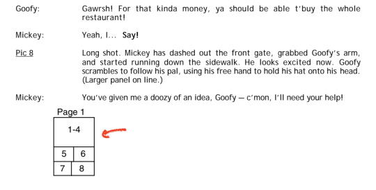
This is because most comics are made by teams of more than one person, and the person who writes the plot/dialogue is not the person who does the layout and sketches - and usually that's not the same person who does the inking, the coloring or the lettering. So each stage of the process needs to be clearly laid out.
This is not how things work for comics made by a single person, and this is also not how my brain works in specific. If I try to write a script first, the characters inevitably end up being incredibly wordy and go off on philosophical tangents, and the dialogue doesn't fit right on the panels. And once I start drawing the actions I've choreographed, half the time I'll only get a few panels in before a character wants to do something unexpected but much more interesting that completely derails all my best-laid plans. None of my scripts ever survived contact with the page.
Fortunately, because I make art digitally, I can do things like "write all the dialogue straight onto the blank page" and then move/edit the text however I want. So the process I've developed that works for me specifically involves me storyboarding out the dialogue and paneling straight on the page rather than starting with a screenplay or script.
That's not to say it goes straight from my brain onto the page. If I'm stuck on a scene I'll usually crack open a little notes file and write out things like "what just happened, what is this character feeling, what do they want to do next" or just spitball possible dialogue options or write out a little mini-timeline of events in linear order. This gives me a guideline to reference when I sit down to storyboard, and it can help me work through a little knot of writer's block. Even then, the dialogue I hash out there isn't going to be as well-paced or as good as what I end up putting on the final page. It's a first draft of a scene - translating it onto the page, it'll play out differently.


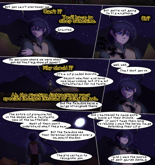
This works well for my storytelling approach, which is flexible and character-driven. I like to give myself a lot of options - a toolbox to play with - and that means my outlines are often very loose, and can change a lot before I put them on the page. But this is a strategy I developed for myself through trial and error - it's not going to work for everybody.
I recommend you start off by reading a wide array of comics with an eye for how they were laid out and scripted, and test a few methods for yourself to see what works best for you. And also read Scott McCloud's Understanding Comics, it's an incredibly valuable crash course!
251 notes
·
View notes
Text
Lappy fancam animatic blogging/production notes
now that wolfgirlyaoi is out on global its rambling time about my powerpoint presentation
Concept
Originally I wanted to do an (Tex & Lapp) animatic with the boss theme (broken wall/Signore dei Lupi .mp3) ever since the event dropped but I thought 1) by the time I finished anything someone else would have probably already done it first (lol, lmao even) 2) I remembered the song exists and how much i looped it then while listening to the group's new album drop and thought the lyrics fit Lapp a little too well and also doesn't end abruptly like the boss theme + was shorter so yea
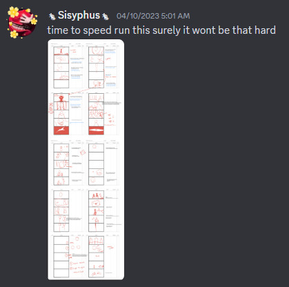
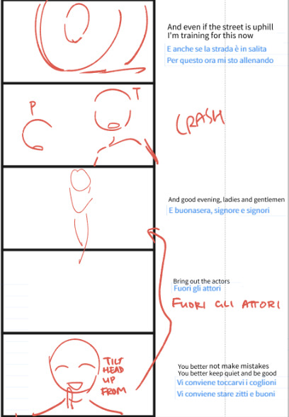
initial stickman storyboard where i put down the lyrics with event dialogue/happenings that i felt would fit nicely together > hastily scribble the images that form in my head
storyboards were basically what i wanted to see (same rule as my comics) lol especially if they weren't shown in the event CGs, eg. there's a CG of the truck crashing into the courtroom so I didn't do that but they didn't mention her physical acting in that scene + the song I used has a bow/salute at that exact part in their live choreo with the very similar line so I wanted to do a homage even though-
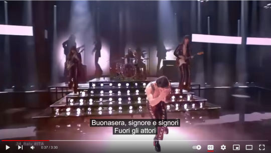
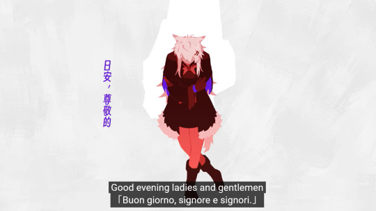
-I was like it's going to be such a pain to figure out an economical hand twirl and bow but I have to do this I need to transplant the image in my brain onto the screen because official media did not do a—
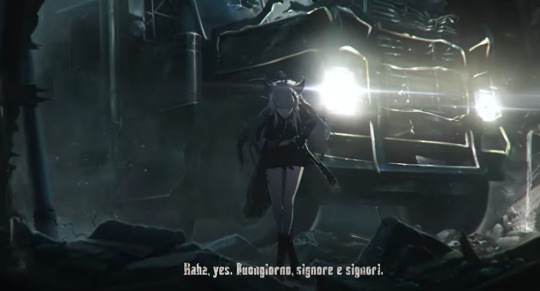

Honestly still don't know if its a common phrase and action combo because I was having so much trouble finding external references that wasn't just scrubbing the live video over and over anyway
part of the storyboards were 'recycled' from comic drafts I did (of the chocolate scene because ofc) when the event was running on CN
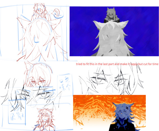
Originally I wanted to draw Lapp feeding Texas for The Girlyaoi Funny but I wanted to reference the plaque you get which is a Creation of Adam reference right but I also saw people saying it's referencing the scene from Silence of the Lambs lol so...peel the layers to your liking!!

(The chocolate flavour choice was from asking my Columbian friends what the worst chocolate flavour they ever tried which was white coconut)
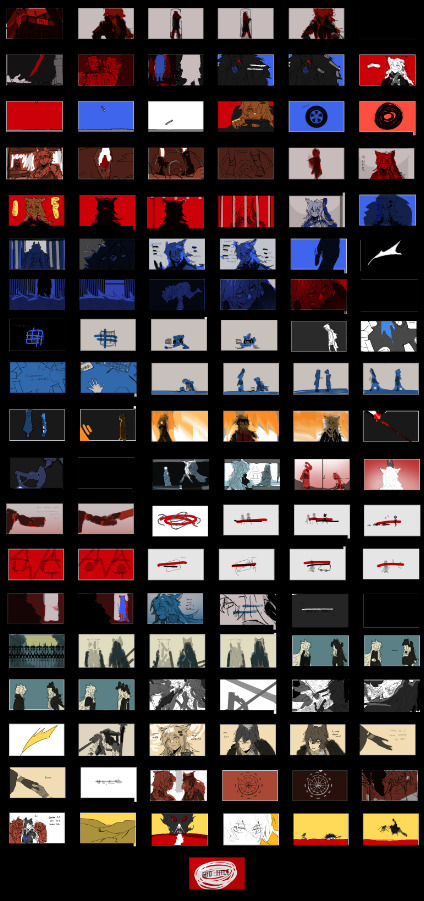
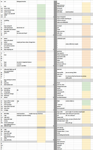
my sorry attempt at colour keys > final spreadsheet to keep track of progress and paste all the dialogue i put in
Art Direction
A bunch of shots/colour schemes are references to Måneskin's stuff or other media tehepero I'll just put a few here
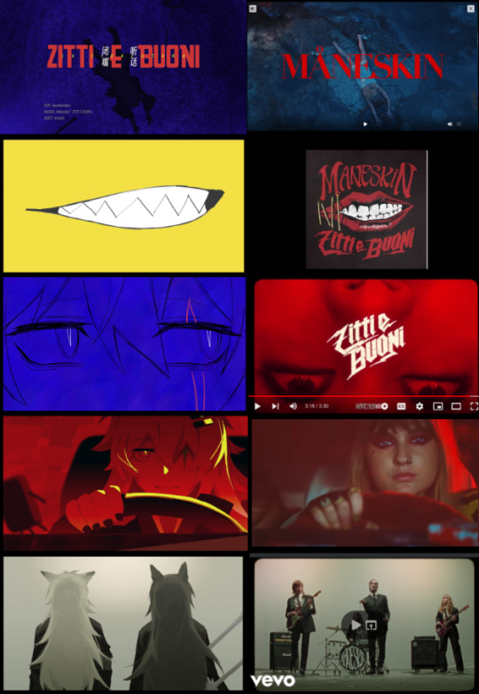
At first I was going to limit red/blue to tex/lapp respectively but since Omertosa is blue I just did away with that rule and lapp gets to have both (and more!) these two colours have pretty obvious emotional readings I think but also
red = self blue = society Siracusa or: red = yaoi & blue = yuri
for the others:
Purple = Alberto/Saluzzo, its not orange like the fruit he keeps holding because see below; I needed the colour for something else LOL Also the Saluzzos are iirc nobility or whatever and they have purple hints in their clothes so I think it was a good fit anyway
Yellow/Orange = Its supposed to be representing the last word in the story which apparently, yostar went with 'Savagery' which is Correct I guess but (laments again about how nuance is lost in localisation because imo savagery has a more derogatory kind of connotation while I think 蛮荒 in context of the story also has a 'nature/untouched by civilisation' side to it) which is why Texas setting the house on fire was not (entirely) red but orange (and it complements the blues both visually and thematically) and it's yellow at the end when they're frolicking(?) in the wilderness lol
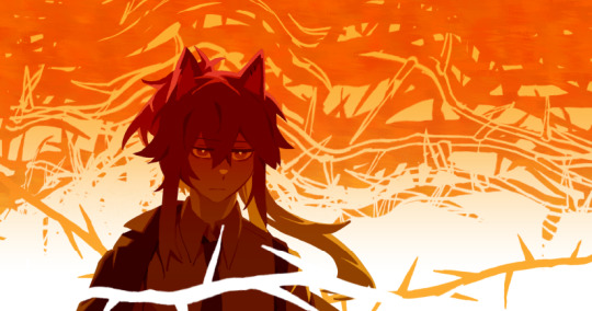
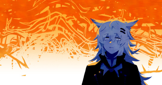
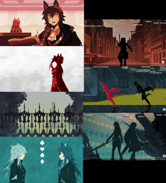
(these colour rules don't apply to the penglog shot and technically a few frames like the shot with shocked penance, the one right after and 'im just lappy' because...i forgor my own rules lol)
The greens/teals were just a reference to the shades in the 3DPV I think
The silhouette/general style was inspired from the 3D teaser thing they had at the beginning of the 3.5 anniversary stream and the card suits that I..forgot to move to the other layers which is why only the green one had them (supposed to be 1 per set 💀)
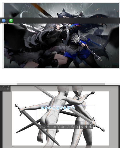
The clash bit is basically the same as the event CG but with a flipped camera/POV sorry for world's worst screenshot lmao. Couldn't imagine the poses in my head so I ended up posing 3d models in CSP pretty good posing practice
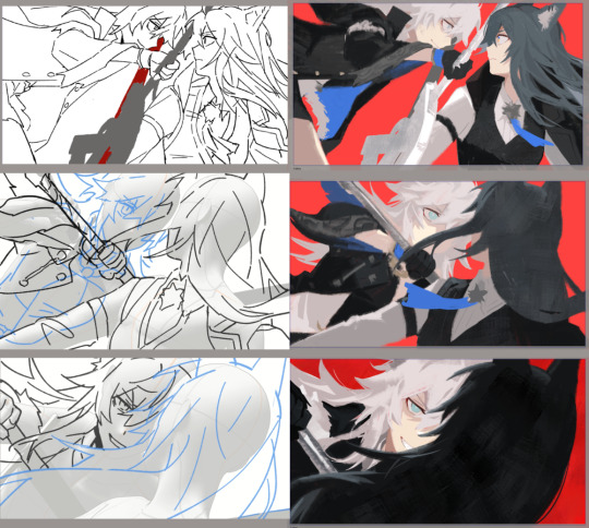
These shots got rendered extra because..they were the first frames I started on and I was still figuring out how much to simplify lol
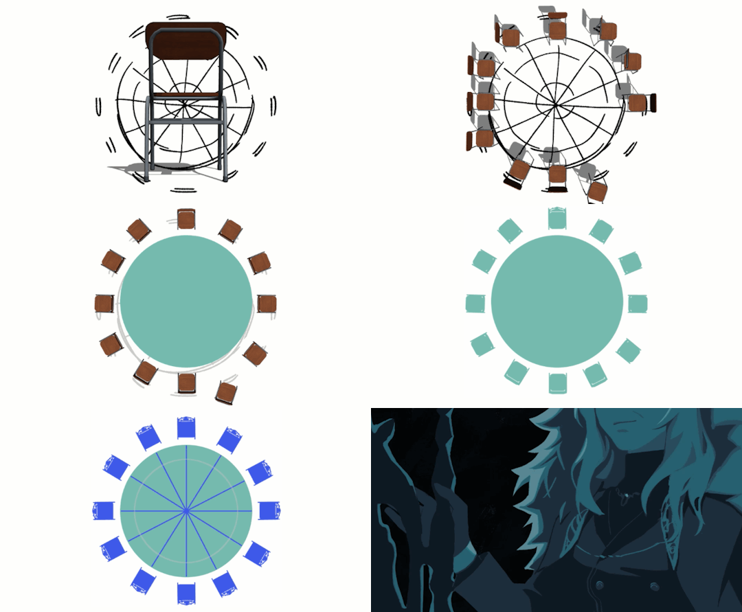
I also posed the chairs shot for some inexplicable reason…my file was lagging so bad
Headcanon part (kind of)
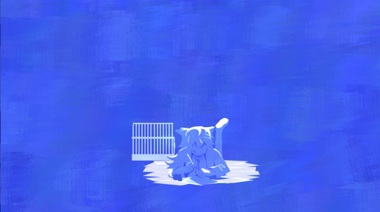
The childhood flashback scene is probably the part I took the most liberties (headcanon) on since it's not explicitly canon like the rest...the sequence/how I connected the scenes itself to fabricate a timeline of her childhood was kind of inspired by some weibo post musing about how (iirc) texas's sweet tooth maybe came from when she was being fostered at casa Saluzzo and Lapp treating her like a pet essentially and giving her a lot of treats since...you know what happened to her actual pet hehe except maybe texas offered her a stick first and then Lappy just reciprocated endlessly because its one of the few 'acts' she knew that wasn't violence haha yeah this section was basically a stealth doujin sorry
It's mentioned that she was brought up as the ideal Siracusan or whatever and she does the cute doodle in the 3DPV so I thought she probably had the Forced Music Lessons as a kid (The music sheets are Bella Ciao and of course)
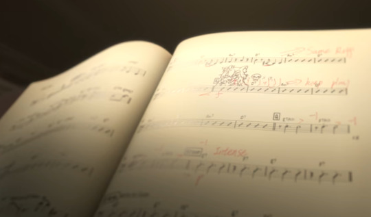
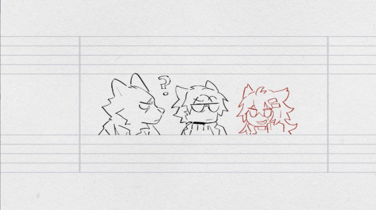
The bow choreo was the one thing i really wanted to animate but the music sheet segment (based on that one split second shot above) ended up being my favourite part even though compositing the motion was a mini hell on it's own (ended up compiling a long png to scroll by with the red doodles layered over)

Other things
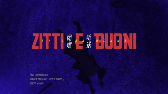
I will never live down my (self-imposed) shame of misspelling the title (I fixed the title on youtube but its why the ending shot in the upload says ZittE e Buoni instead of ZittI e Buoni) don't rush your fancam in 10 days 😔
I didn't look through the entirety of the EN loc but Idk why they had Lappy say 'Then go.' to Texas when it's supposed to be more like 'Let's go.' as in, 'let's go together' as opposed to 'alright off you go to the greyhall alone' lmfao also her saying goodbye forever padre when addio is right there
I don't think I'm insane enough to do another ppt soon but man this pair really makes the 'imagines a whole music video while listening to music' part of my brain go wheee like first it was Starset's Manifest then Signore de Lupi then this and while working on this one i was thinking how Måneskin's Torna A Casa would be another good track
ok ty for reading #GIRLYAOIREAL
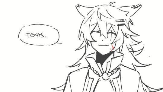
#arknights#Il siracusano#bentodraws#bentotexto#I was going to have this post as a reblog but tumblr broke my copypaste so here's a completely separate post#feel free to ask me about anything else i didn't cover in here
153 notes
·
View notes
Text
Today’s translation #770
Animage Feb. 2017, Shishido Jun's interview (Chief Episode Director)
Part 4.
-- Body shape of skaters is also very unique, isn't it!
Shishido: I think that fans noticed this immediately, too, but the most important point is precisely a skater's beautiful butt! The Director wrote 'butts!' in her storyboards, so we also all understood that 'oh so you're going to show the butts, huh?' (laugh). The Director told us that 'skaters' butts are all muscle, and so well developed that you can place things on top', so we all aimed to draw attractive butts, in a sexy way, but not make them look soft, but firm and muscular. I actually were asking animators to make sure they got this point right.
-- What about scenes other than the skating scenes?
Shishido: I drew storyboards for a few everyday life scenes for practically all episodes. The scene in episode 7., in which we see Yuuri crying in the underground parking lot, for example. About that scene, the Director's request was that she wanted to show emotions of Yuuri and Victor, so we used close-up shots, and close-ups of the character's eyes to liven up that scene. The highlight of the scene is the beauty of Yuuri's tears. I also did storyboards for that scene in episode 9., in which Yuuri and Victor hug at the airport. And the scene, in which Yuuri eats Yurio's pirozhki.
-- A lot of very good scenes!
Shishido: When I draw storyboards, I insert myself into the characters and try to understand their emotions and the way they think as if they were me. I make the characters move, completely immersing myself in them. That's why, when I'm drawing Yuuri, I'm a timid boy, when I'm drawing Victor, I love Yuuri so much and when I'm drawing Yurio, I become tsundere (laugh).
14 notes
·
View notes
Note
hiii!!! loving your locket comics!!!!!! just wanted to ask a few questions about your process, if you dont mind :D
whats your general process like?
do you do thumbnails, how do they look like?
roughly how long does it take you to complete a comic panel or page?
how detailed are your sketches? do you do multiple?
do you have any specific techniques for lineart?
do you typically use references for your comics?
generally, how much effort and focus do you put into your comics?
do you have any advice for drawing comics?
sorry for for the absolute bombardment of questions, lmao. just really enjoy your art and comics and very interested in the behind the scenes!! feel free to skip any questions (or this whole ask) well wishes and salutations!!! :D
Hello! I'm so glad you enjoy my comics, and I totally don't mind breaking down the process!
For a normal comic page, I would likely actually write a script since it's much easier to keep track of dialogue and actions. But since these are short, I just write it into my thumbnails.
Step 1: Thumbnails. Easily one of my favorite parts, since I get to throw all my ideas down. I do these comics on a 2-panel grid, so I don't have to worry about actual paneling, and it allows me to focus more on the setup of each shot. Think of it like storyboarding!

Step 2: Add cleaner thumbs if needed. I actually made 3D models of Deadlock and Ratchet's chest in Blockbench, so I often trace them to save myself some time! (It might look insane, but I promise, for me, it's not.)
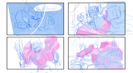
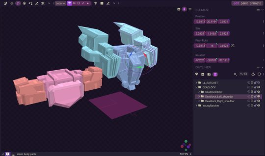
Step 3: Lettering! I actually like to get the lettering out of the way right away since it can take a while. Ever since I started treating lettering as its own form of art, my skills have gotten better, but it also takes much longer.

Step 4: Clean sketch! I'm just now finding out that people think I’m doing lineart for these? I am not… these are all just clean sketches. Maybe doing the blackwork gives the illusion of lineart?

Step 5: Color! Most of these comics are in black and white to save time, but it also lets me focus on values and shot framing again. I add my glow overlay to the eyes, and boom, done!

Roughly how long does it take you to complete a comic panel or page?
It really depends on how complicated the panels are. I like to step out of my comfort zone. I know the Grimlock and Misfire one took longer because of how many panels there were and the fact that I was drawing characters I’d never drawn before, but I’d say it usually takes around 5-8 hours for a whole page.
Do you typically use references for your comics?
I'm literally the reference GOD- we all know this. But yes, I love using references and doing character studies. I have yet to do a study on LL Drift, but I have a few references of him that I’ve made.

Generally, how much effort and focus do you put into your comics?
I mean, I wouldn't say I don't put in a lot of effort? I put in enough. I don't know… there's a point in the clean sketch process where you can kind of just turn off your brain. I'm passionate about comics, but we can all agree there's a point in a drawing where you just zone out.
Do you have any advice for drawing comics?
I think being able to balance dialogue and visuals is super important. I don't know if you guys have picked up a graphic novel from Barnes & Noble recently, but if you open a page, you'll see a character sitting with the biggest bubble you've ever seen, filled with paragraphs of text. While I get it—being a novel as much as it's graphic—I personally like to visualize emotions more. If it means adding two more panels to make an interesting dialogue setup, I don't mind doing it. Another thing to remember is that not all panels need to have details or 100% effort. Sometimes you need to simplify and move on, and that's okay! Those two extra panels that are giving you a better stage setup might be the ones that need fewer details and less time. I would consider my comic page work and my 4-panel work very different. One is about paneling, setup, and visuals, while the other is very much like storyboarding. Both are skills you learn with practice and study.
10 notes
·
View notes
Text
"Kids with passion to play make-believe;
Will become young adults with the will to achieve"
Alright, so I figured I wanted to make this eventually. I finally finished my part for the Guaraná MAP a few months ago after like, almost two years of having it lmao, and those two years were wild and included a bunch of different versions of the part which would never see the light of day outside of the map server, so I figured I should put them all here :)
Here is the finished part which I am very happy with honestly, love some Hollyleaf angst
youtube
So now let me tell you about how the part used to be IWKFOLSPS
To get the part I actually had to fist fight a friend because it was one of the few really simple interesting parts and we both wanted it pretty badly
When I eventually got the part I made two storyboards for it, and my idea was for it to be very limited animation with mostly tweening, as, in my head, it would make my life easier
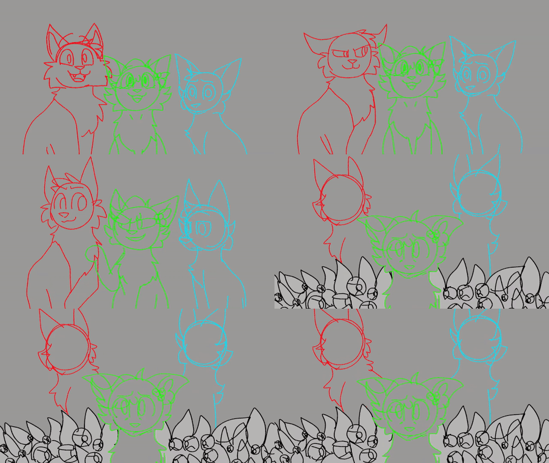
The first storyboard I was not happy with so I threw it out the window and made another soon after
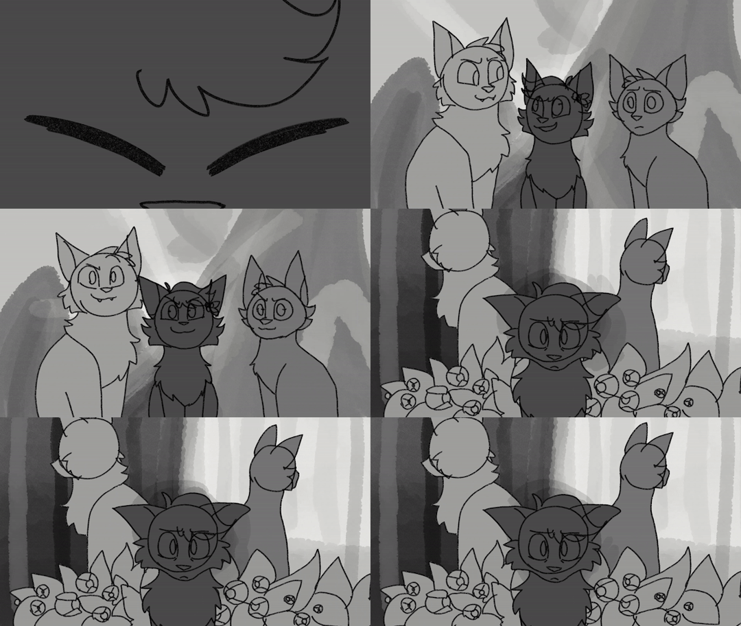
This one I was way happier with and is the storyboard I used for most of these two years, here you can see a little light/shadow behind Hollyleaf that, while I liked, was really out of place so I didn't keep it in the end :(
What followed was multiple months of me chipping away at this part and telling myself every time that it would be easy to do because it was pmv, I got pretty far with this, making the assets for all of the cats and only needing to shade Hollyleaf, finish the backgrounds and guaraná plants and edit
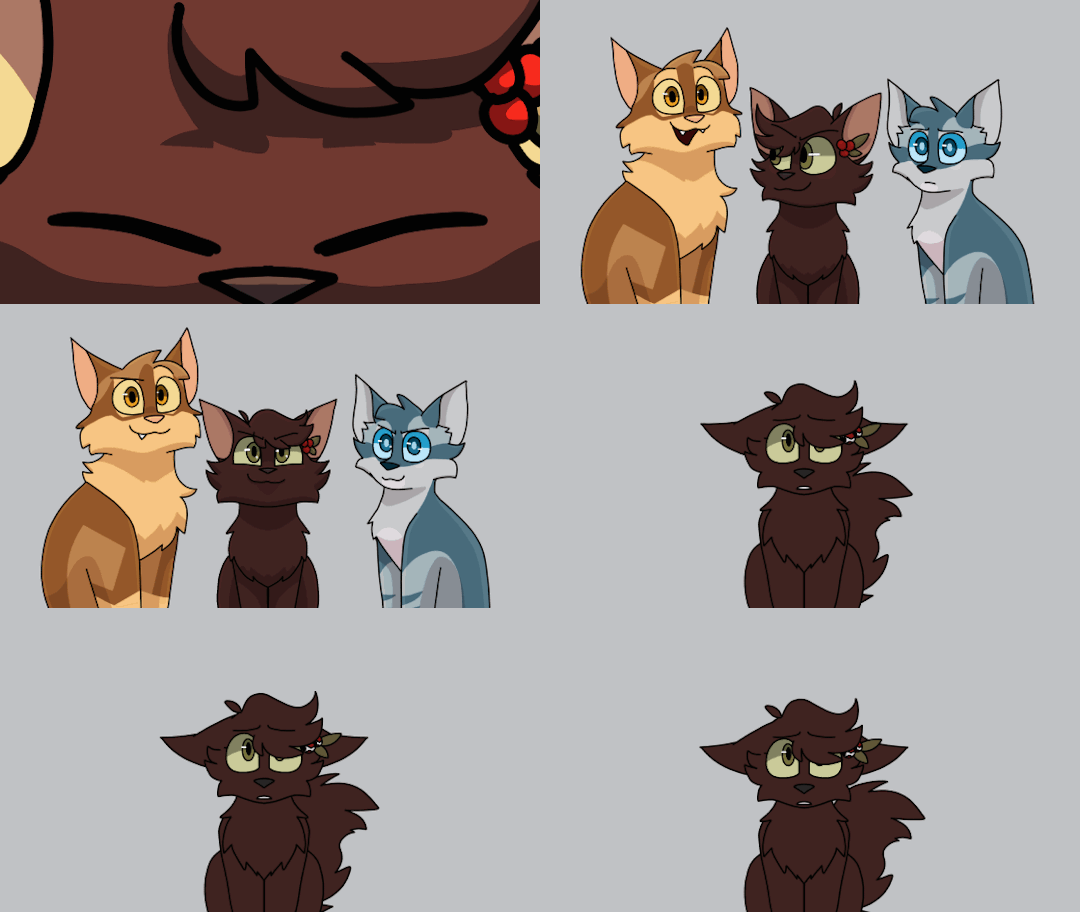
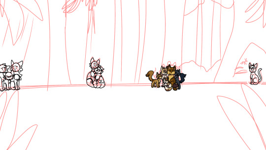
At that point however, despite being almost done, I really couldn't bring myself to work on this part anymore, I'm not sure what exactly it was, but messing around with all the assets and tweening and all that just wasn't fun for me at that point and I just began stalling to avoid having to open the file again
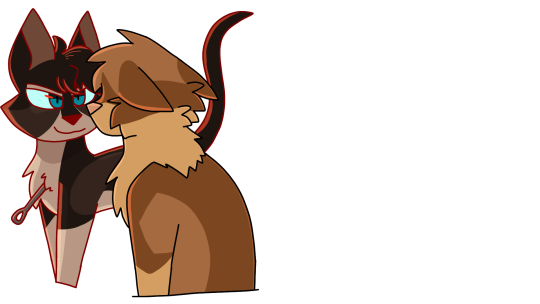
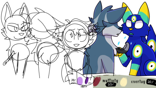
Eventually in February a light shone upon me, if I wasn't having fun with PMV then screw it AMV was my new best friend
In a few hours I made a new sketch, skipped the rought animation stage and finished Holly's entire animation (don't do this ever, don't be like me)
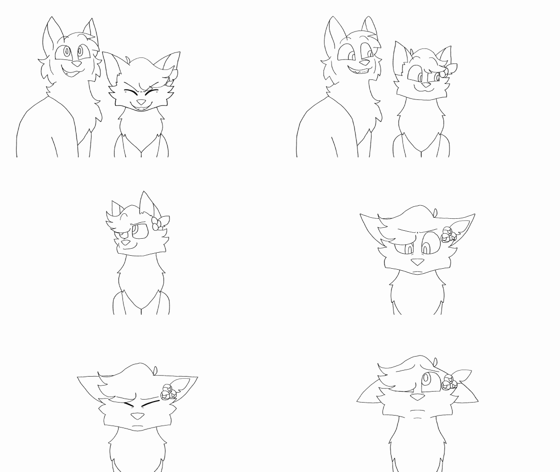
I had also started on Lion but I was struggling on what to do with him because of how I animated Holly lol
I don't remember the exact plan but originally the character acting was:
Holly and Lion are looking up, Jay is a little frustrated. Holly talks to him to cheer him up and he looks at her, feeling a bit more encouraged. Then she would look at Lion, he would reassure her, and they'd all end up happy
Somehow though, while animating Holly, I ditched the plan and made her be surprised by Lion and look at him, so I struggled a bit trying to figure out what Lionpaw could do to get her attention, and spent a good while trying to figure out the solution to a problem that I created in a few hours of not following a simple plan ISMOCKSKKDS If you plan something, preferably follow it, don't be like me²
I could have just remade her animation so that would have been solved but I liked her animation I didn't want to redo it :(
Anyway, eventually I figured he could say something stupid to help cheer up Jay or something and I like his and Jay's new movements so it all worked out :)
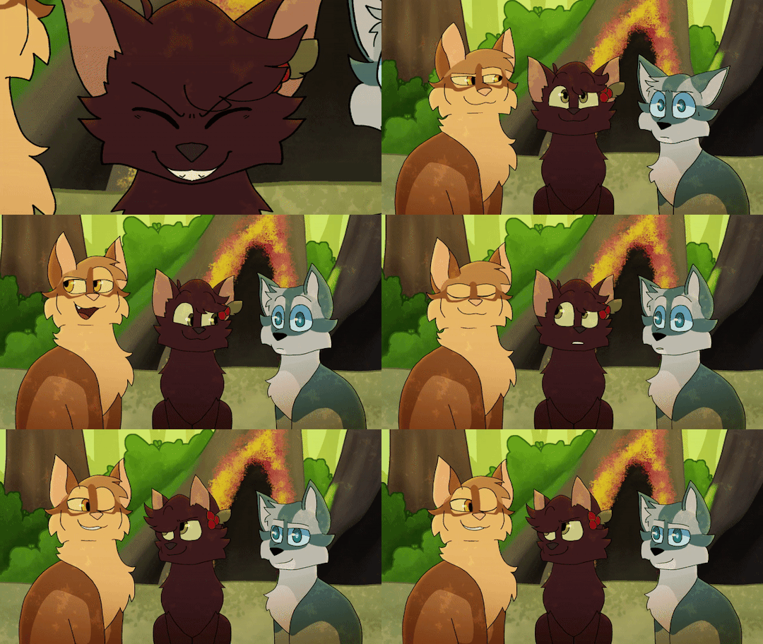
After making the first shot, I caved in to something I wanted to do for a while which was a transition between the shots, instead of having it cut to the second shot or move the characters around a little bit.
I didn't know if I wanted to do a transition with stars or with the fire scene, until eventually I figured that the fire scene and Ashfur's... thing was what really affected the siblings, especially Hollyleaf. The part also follows a sequence of Hollyleaf feeling guilty for what she did so in general I thought that Ashfur would transition well
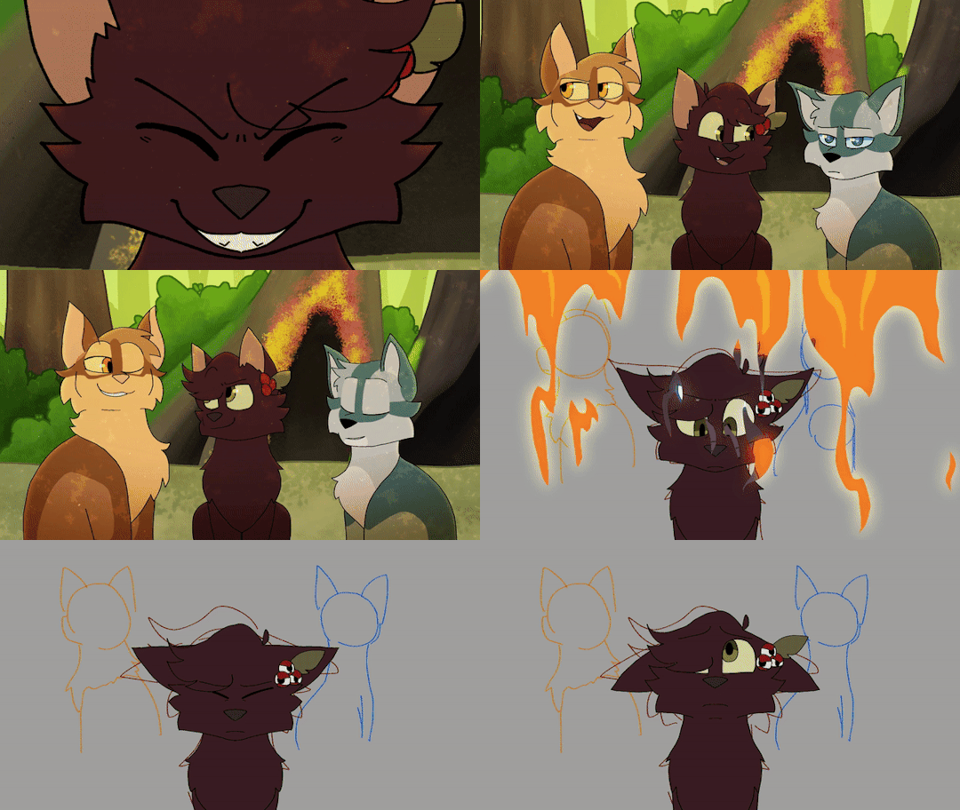
You may also notice that I hadn't splattered blood all across Holly's face in the second shot and that was because I forgot she was supposed to have blood on her until I read the script again for some reason and realized I forgot ISNKCKAKDLSL
So, what did we learn? PMV sucks, animate it all at 24 fps in one sitting instead/JOKE
This is all I have about the Guaraná part, it was pretty fun to work on and I loved joining a map about my country, this map lives in a little part of my brain rent free <3
Might do this for other parts that have a bunch of wips or something I'll think about that, it's kind of fun to just lay out your process like this, would recommend 10/10
#map part#sylv rambles#warrior cats#hollyleaf#lionblaze#jayfeather#ashfur#animation#Youtube#sylv animation
50 notes
·
View notes
Text
This is one of the cinematics I worked on at Chase A Cloud as an illustrator intern. I drew a few shots of the Priestess herself and the dark monsters at the end and assembled and rendered a bunch of the other shots. Other character drawings were made by Konstantin Vitkov Titis, Nicole Virella, and Marco Castiello, the backgrounds were illustrated by Madhava Amrith, compositing by Nasko Filipov, Vladi Lakov, and Teodor Ralev, storyboards by Konstantin Vitkov Titis, Rali Aleksieva and Micol Ganzerli, art direction by Sava Komitski on our side. I am very thankful I was fortunate enough to be a part of this project.
I also started glazing my images because the big corporations can suck it.


#digital art#illustration#concept art#fantasy#character art#comics#magic#priestess#anime#stylized#artists on tumblr#no ai used#dark fantasy#game art#cinematic
12 notes
·
View notes